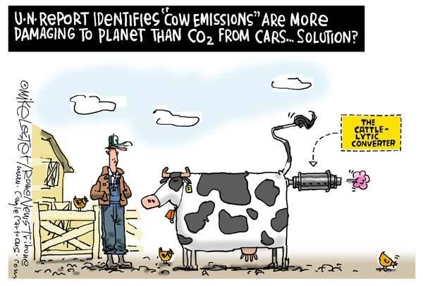
Bob Graham, Chairman of Highlands Against Windfarms, posted this comment to the Telegraph
Sir – Once again the public are being misled by the wind industry. These windfarms, which are going to cover over 100 square miles of the approaches to the Thames Estuary, will never power one third of London homes.
If as suggested the installed capacity of the 400-plus turbines is 1.3 Gw (1300Mw) then even with a generous load factor of 30 per cent the average output will only be 390Mw. This would in fact be enough to provide 5Kw to 78,000 homes, about enough to power an electric kettle and a toaster. If, as there frequently is, a high pressure system is sitting over south-east England , then there will be zero output from these windfarms. The claims about carbon dioxide savings are equally dishonest. Using widely accepted data the annual, theoretical savings of CO2 for these turbines would be approximately 1.46 Mt and would reduce global levels by a farcical 0.005 per cent
What your readers really need to know is that these windfarms will receive approximately £160 million per year in subsidies, paid for by them. This windfarm scandal has gone on long enough and needs to be exposed for what is. We are destroying our landscapes and now our seascapes for nothing more than green tokenism, and are being expected to pay for it as well.
What? £160 million per year. Ok lets do the sums again. £160 million is equivalent to AU$400 million, and for just $468 you can provide a child in africa or bangladesh water, education, food, shelter and medicine.
0.005 per cent of 0.6 degrees per centry increase means that the wind farms will be saving at most 0.00003 degrees per year, or we could give that money to the poor and give 854,700 children things that we in the western world take for granted.
That's almost a million children could be given food, shelter, medicine, education and fresh water every year for the rest of their lives.
The environmental motives of rich people in western countries are killing people in the worlds poorest nations.
Gust of Hot Air is a blog outlining my own statistical analysis of Australian Weather. I am Jonathan Lowe, and have completed by Bsc(hons) in statistical analysis as well as my Master of Science. I have done 2 years of my PhD There is a lot of statistical information regarding climate change and I intend to provide statistical analysis into the area to prove if the recent well advertised rise in temperature is at all statistically significant. Results will be uploaded here on a regular basis
Thursday, December 28, 2006
Energy bills to increase by up to 40%
Engergy bills are tipped to increase by up to 40% according to Federal Industry Minister Ian Macfarlane.
"I don't think the consumers fully understand the price tag associated with lower greenhouse gas emissions,"
he told The Courier-Mail in an exclusive interview. He said solar power was four to five times more expensive than electricity from coal and that wind power was twice as expensive - even though it was heavily subsidised.
"While the energy source is free, converting that to electricity is expensive,"
he said of wind and solar power.
What happened at the AGU?
limatologist Kevin Vranes talks about his concern about the evolution of the global warming
We tried for years - decades - to get them to listen to us about climate change. To do that we had to ramp up our rhetoric. We had to figure out ways to tone down our natural skepticism (we are scientists, after all) in order to put on a united face. We knew it would mean pushing the science harder than it should be. We knew it would mean allowing the boundary-pushers on the “it’s happening” side free reign while stifling the boundary-pushers on the other side.
But knowing the science, we knew the stakes to humanity were high and that the opposition to the truth would be fierce, so we knew we had to dig in. But now they are listening. Now they do believe us. Now they say they’re ready to take action. And now we’re wondering if we didn’t create a monster.
We’re wondering if they realize how uncertain our projections of future climate are. We wonder if we’ve oversold the science. We’re wondering what happened to our community, that individuals caveat even the most minor questionings of barely-proven climate change evidence, lest they be tagged as “skeptics.” We’re wondering if we’ve let our alarm at the problem trickle to the public sphere, missing all the caveats in translation that we have internalized. And we’re wondering if we’ve let some of our scientists take the science too far, promise too much knowledge, and promote more certainty in ourselves than is warranted.
Thursday, December 21, 2006
Bad Santa
Franesca Price has written an article in the Sunday Star, a New Zealand newspaper entitled "Bad Santa". It talks about how our landfills are overloaded (??) and how we can make this christmas a greener christmas. And her word is spreading. One of my friends has decided to wrap her presents in coles recycle bags instead of wasteing wrapping paper.
She also suggests to buy less presents to conserve energy, saying that you may be less popular at christmas time, but don't worry, your kids will still love you.
She does, to her credit, suggest to buy a goat for Oxfam, a great cause. However, her decision to buy her friends Carbon Zero Credits?
You can buy carbon credits to offset a loved-one's CO2 emmissions and the money is used to regenerate native forests.
But native forests love CO2! Either way, I' not going to be a grumpy bum scrooge this christmas, unlike Francesca.
Wednesday, December 20, 2006
No matter what way you look at it: Antarctica is still cold
Count Iblis II has been hot on my trail. Unfortunately he doesn’t really know a lot about statistics claiming that “P values that are not very low are meaningless”. This is unfortunate for him, however he has been pushing me to do some analysis to see if there is a significant difference in the current trend of temperatures and an increase of 0.6 degrees per century. So, I did and here are the results:
There is no evidence to suggest significant lower maximum temperatures than a 0.6 degree increase at Mawson (F = 0.72, p= 0.4; -0.006 +/- 0.013 per year – note that even though the difference is not significant, the trend is still amazingly at a negative 0.6 degree less trend per year).
However, there is evidence to suggest a significant lower minimum temperature trend than a 0.6 degree in crease at Mawson (F=5.26, p = 0.026, -0.017 +/- 0.015 per year).
Tests were done using Mawson’s (Antarctica) maximum and minimum temperatures. So we can conclude that despite what we would normally expect of a 0.6 decrease in maximum temperature (as compared to an increase in 0.6 degrees), the result is not significant. One must conclude that we need more data in this case, as results only go back to the 1950s for Mawson’s records.
However when looking at minimum temperatures, we can conclude that the difference is significant. So in summary:
There is no evidence to suggest tat Mawson’s maximum and minimum temperatures are significantly increasing or decreasing. There is no evidence to suggest that Mawson’s maximum temperatures are significantly lower than a 0.6 degree increase per century, however there is significant evidence to suggest that Mawson’s minimum temperatures are significantly lower than a 0.6 degree increase per century.
In other words, Mawson (Antarctica) just isn’t heating up, and not even close to a 0.6 increase per century.
Sunday, December 17, 2006
Thursday, December 14, 2006
Never new there were so many frogs
Although this is news a little while ago, I thought I'd give the author a chance to reply:
News is that global warming has already made a terrible toll. According to Camille Parmesan of the University of Texas, at least 70 species of frogs have already become extinct. She did a review of 866 papers (so she didn't do the research herself, just has summarised others).
"I feel as though we are staring crisis in the face, It's not just down the road somewhere. It is just hurtling toward us.
But of course there is this information to:
While it's impossible to prove conclusively the changes are the result of global warming, the evidence is so strong and other supportable explanations are lacking, Thomas said, so it is "statistically virtually impossible that these are just chance observations."
So it's impossible to prove, but impossible to be anything else. And what's more, statisticall impossible - can you give me a p value on this conclusion? Thought not.
I emailed Camille Parmesan, asking her if she can give me the list of the 70 species of frogs that had gone extinct.
I have yet to receive a reply.
Tuesday, December 12, 2006
Humans responsible for 1/50th of recent warming
According to a new paper by Khilyuk and Chilingar (2006) which was presented in the peer-received journal of Environmental Geology, they show that
[a]one percent increase in current solar radiation reaching the Earth’s body translates directly into approximately 0.86 K increase in the Earth’s global temperature.
They continue to show that the earth’s orbit about the sun changes over long periods of time resulting in up to 7.5°C modulation of the earth’s temperature and conclude that
The scope and extent of these processes are 4–5 orders of magnitude greater than the corresponding anthropogenic impacts on the Earth’s climate (such as heating and emission of the greenhouse gases).
And
the global warming observed during the latest 150 years is just a short episode in the geologic history. The current global warming is most likely a combined effect of increased solar and tectonic activities and cannot be attributed to the increased anthropogenic impact on the atmosphere. Humans may be responsible for less than 0.01°C (of approximately 0.56°C (1°F) total average atmospheric heating during the last century)
as far as what we should do about it, the conclude that:
Any attempts to mitigate undesirable climatic changes using restrictive regulations are condemned to failure, because the global natural forces are at least 4–5 orders of magnitude greater than available human controls.
And on Kyoto:
Thus, the Kyoto Protocol is a good example of how to achieve the minimum results with the maximum efforts (and sacrifices). Impact of available human controls will be negligible in comparison with the global forces of nature. Thus, the attempts to alter the occurring global climatic changes (and drastic measures prescribed by the Kyoto Protocol) have to be abandoned as meaningless and harmful
Wow, amazing. In such a stringent peer-reviewed scientific journal as well.
England spend $2.5 Billion on Cars - Millions Starve
England will spend AU$2.5 Billion over the next four years replacing the governments 78,000 vehicles with cars that are much greener and slash carbon emissions by 15% according to TimesOnline.
What? a 15% decrease in carbon emissions and the are prepared to fork out $2.5 billion for this?
Ok, the average car produces about 6 tons of carbon dioxide a year. So 78,000 cars and we have 468,000 tons. A 15% decrease means that AU$2.5 billion will save the world from about 70,000 tons, which is of course a good effort.
In 2001, the world produced around 24,000,000,000 tons of carbon into the atmosphere. This means that the 70,000 tons that the UK government is going to save will be about 1/300,000th of the carbon emissions saved. Basically, jack shit.
According to Wigley (1998), if we are to reduce our emissions by 43% this will result in a decrease in world temperature of 0.07 degrees C. Basically immeasurable by normal ground thermometers.
So lets do some more maths, and we find that England, in spending AU$2.5 billion in changing their cars over will reduce the world wide temperature of around 0.000000023 degrees Celsius.
Well done.
But wait there’s more. According to World Vision Australia. For just AU$468, one can sponsor a child in Africa or Bangladesh. They will receive education, medicine against diseases, and fresh drinkable running water. What we all take for granted, but is a luxury in some of these parts of the world. Essentially, the British government could have spent their AU$2.5 million on this, and sponsored 5.3 million people, but they obviously have other vote grabbing agendas.
Tell me which you would rather do. Reduce the world wide temperature by 0.000000023 degrees Celsius or give over 5 million starving malnourished children shelter, water and medicine?
There is no need to answer that question.
Bushfires and no sun!
Massive bushfires in victoria and no sun at all in NZ. My dolphin and whale boating trip was even cancelled due to massive rain and huge winds.
Damn Climate Change! The IPCC are right, climate change is going to cost us heaps and maybe even ruin lives.
I guess that's what happens when you spend billions on changing something that isn't going to change much, instead of the sick, starving people in say, Africa or Bangladesh. I mean you've got a choice? Spend money on the malnurished people living today with no form of opportunity in their life or spend on money on maybe changing the lifestyle of people 100-1000 years from now. Hmm.....
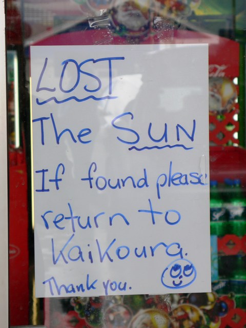

The ocean is colder....kinda
In the latest article by Ivchenko and Aleynik (2006) as posted in the journal Geophysical Research Letters, and as outlined by the World Climate Report shows that
almost all depths, including the surface, the entire North Atlantic Ocean has less heat content from 1999-2005 than on average during the previous 100 years
and that
the trend in heat content is clearly downward or non-existent. Any warming appears only north of 50°N.
Damn! The ocean gets cold in melbourne, I would have enjoyed a warmer swim.
It's green to be hot
Monday, December 11, 2006
Cricket Ban
Well, it looks as though some of my friends have to give up their favourite pastime in Geelong because they don't have enough water to water the grounds. Cricket has been cancelled for the upcoming year.
This considering, that despite us having a lower than average rainfall, it is far from the worst drought we've had. We're just using too much water.
In fact, isn't it funny that the seats in the latest election that most favoured the greens were Fitzroy, Richmond and Melbourne, the cosmopolitan seats in Melbourne and furthest from the bush. Yet, Fitzroy has had the greatest increase in water usage, up 20% per person. I guess it’s all about do what I say, not what I do. Kinda like, we must act now and reduce power – but I still want my Air Con, TV, and Car.
The Glaciers are growing in New Zealand
My trip to New Zealand included a great look at the world heritage Fox and Franz Joseph Glaciers. It was interesting to see how they moved. In general, these glaciers increase in size by about 1.5 meters a day which is huge compared to other parts in the world. This is caused by snowfall and the névé, which is at the very top of the glacier or top of the mountain. But the glacier also melts at the terminus, which is the very bottom of the glacier. Depending on how quickly the snow falls up the top and the temperature down the bottom defines if the glacier increased in length or not. Obviously the two factors are highly correlated. There is a 5 year delay in the amount of snow falling at the névé and the length of the glacier. E.g. If we had a bumper snow fall this year, it would take 5 years to see the effect of this on the length of the glacier.
Now for a bit of history. Back in the ice age, around 10,000 years ago the glacier actually fed into the Tasman Sea. But since then has been case of gradual decrease. In fact sign posts around show where the glacier was in 1740 and 1840 and today based on rock studies and more recently photographs and explorers diary’s. But since the mid 1980’s the glacier has actually grown in size. In the mid 1970s the glacier was nothing great to look at, and could hardly be seen from the lookout post, but it has grown quite a bit since, in some cases growing by as much as 70cm in a day.
So what does this mean? Well obviously the length of the glacier has a strong relationship with temperature in the region. This means that the glacier was at it’s longest when the ice age was, and hence we were at our coldest (obviously). Since then, we’ve been coming out of an ice age until about the mid 1970’s, where the weather must have got a lot colder.
So this area of New Zealand has therefore been warming up considerably from about 1750 to 1970 and then getting a bit colder since. This goes against the world wide temperature data of an increase in temperature from 1970, and it also shows that the increase in temperature from 1750 to 1970s was not due to CO2.
Of course I don’t have data on NZ temperatures, so my case suggesting temperature increases and decreases in this area is largely an assumption. There might well be other means of why the glaciers increase and decrease in size that has yet to be discovered (human physical contact perhaps?). However, temperature is largely correlated to the size of the glacier, and this suggests to me that we were still coming out the influences of the last ice age, and that two things just aren’t heating up as much as we expect, if at all, in the central-western region of the South Island of New Zealand.

Wind farms not that windy
The telegraph explains that wind farms in southern scotland are not providing much energy at all.
This produces 7·7 per cent of the electricity it would if there was enough wind for it to run continuously at full power.
The study says the turbine at GlaxoSmithKline's pharmaceutical plant at Barnard Castle, Co Durham, which is in a built up area and uses second-hand turbines, operates at 8·8 per cent of capacity. "We are really talking about a garden ornament, not a power station. These are statements about the company's corporate social responsibility, not efficient generating capacity," Mr Constable said.
Sunday, December 10, 2006
Lets chance the results to suit our needs
Assoc. Prof David Deming tells of some strange funny business when it comes to researching science:
We have to get rid of the Medieval Warm Period.
We have to get rid of the Medieval Warm Period.
Even the IPCC has played down global warming
In their 4th report due to be given out in Feb, the IPCC have downplayed humans involvement in global warming by 25%. This article shows it all. Whilst of course, they still say we are heading towards complete devistation. So how on earth, given the evidence, have they miscalculated by 25%? Maybe they were not 100% sure beforehand?
Thursday, December 07, 2006
In New Zealand
No posts in a while, I'm currently on holiday in New Zealdand until the end of the week. They'll be plenty of posts when I return, including some interesting information about the glaciers that I've visited down here. Back real soon.
Friday, December 01, 2006
Africa's Misery
The Stern report suggests that global warming will hit Africa the hardest, and that we must spend billion of dollars to stop the temperature rising 1 or two degrees instead of, for example, spening billions of dollars on education, clean water, and disease control.
But never mind, according to this article,
Although the 1990s were reported to be the warmest decade of the past millennium, this was not reflected in an unusual increase in the numbers and magnitudes of exceptional hydrological events in South Africa. More recently, the 2005 global temperatures were proclaimed to be higher than any in the recent geological past. Yet again, no exceptional rainfall, river flows, floods or droughts occurred during the year.
neither South African climatologists, nor their overseas counterparts, have produced evidence that links increased carbon dioxide emissions to South African rainfall patterns
and records show a significant 21-year periodicity in the South African annual rainfall and river flow records that is synchronous with solar activity.
As their natural water consumption increases, more focus is put on Africa's energy-consuming seawater desalination of which only coal power is the most econimical to run.
Wednesday, November 29, 2006
Does Global Warming Stop when the Sun Goes Down?
So is the sun a bigger player in global warming than we think? We showed previously that when the maximum temperatures had increased (last 5 years), the increase appeared more so during the day only. Likewise when the yearly maximum temperature was less than that of norm, is was mainly during the heat of the day in which it occurred.
But lets look a little closer. Instead of summing up the data by looking at years, we decided to look at months. In fact a total of 83,000 of them. We decided to look at the months in particular which recorded a maximum temperature of say 5 degrees above the norm. For these months, what was the temperature like during the course of the day?
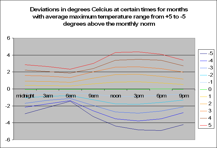 The graph to the left may look very confusing but let me explain. Basically, it shows the average deviation in temperature at certain times of the day, given that month showed a maximum temperature at a certain deviation from the average. Ouch, now that’s something to get your head around. Don’t stress, I shall explain. Lets look the top line, the bright red one. The legend on the right says that this is the average deviation from the norm at certain times of the day when the maximum for the month is 5 degrees above normal. In fact as we go down from 4 degrees above normal, to 3 to 2 and down to -5 we see a trend. The temperature is in fact becoming less. But this of course makes perfect sense.
A particularly hot month will of course have hotter times throughout the day. But what is interesting is that when looking at the graph, is that the greatest deviation occurs from between noon and 6pm when the maximum would occur. However, the deviation at say 3am-6am is nowhere as extreme when the sun goes down, especially for temperatures of negative monthly maximum deviations. Of course one could argue that the temperatures at night do not vary by as much, and hence it would be better looking at standard errors from the norm instead of temperature deviations and this is true, but this is just the first step in looking at time based data during the day.
This analysis alone proves that the current analysis being done by climate scientists based on purely maximum and minimum temperatures is hardly in depth enough – especially if we plan on spending billions of dollars on it. It still seems crazy to me, that the entire global warming science is based on analysis on simple statistics of which even this blog in a matter of several weeks has more than outdone the scientific literature on the matter.
What conclusion can we make to this research in this post? When analyzing a month that has an increased or decreased maximum temperature from the norm, the same deviation doesn’t occur throughout the day, and is significantly reduced when the sun is on the other side of the world.
But lets look a little closer. Instead of summing up the data by looking at years, we decided to look at months. In fact a total of 83,000 of them. We decided to look at the months in particular which recorded a maximum temperature of say 5 degrees above the norm. For these months, what was the temperature like during the course of the day?
 The graph to the left may look very confusing but let me explain. Basically, it shows the average deviation in temperature at certain times of the day, given that month showed a maximum temperature at a certain deviation from the average. Ouch, now that’s something to get your head around. Don’t stress, I shall explain. Lets look the top line, the bright red one. The legend on the right says that this is the average deviation from the norm at certain times of the day when the maximum for the month is 5 degrees above normal. In fact as we go down from 4 degrees above normal, to 3 to 2 and down to -5 we see a trend. The temperature is in fact becoming less. But this of course makes perfect sense.
A particularly hot month will of course have hotter times throughout the day. But what is interesting is that when looking at the graph, is that the greatest deviation occurs from between noon and 6pm when the maximum would occur. However, the deviation at say 3am-6am is nowhere as extreme when the sun goes down, especially for temperatures of negative monthly maximum deviations. Of course one could argue that the temperatures at night do not vary by as much, and hence it would be better looking at standard errors from the norm instead of temperature deviations and this is true, but this is just the first step in looking at time based data during the day.
This analysis alone proves that the current analysis being done by climate scientists based on purely maximum and minimum temperatures is hardly in depth enough – especially if we plan on spending billions of dollars on it. It still seems crazy to me, that the entire global warming science is based on analysis on simple statistics of which even this blog in a matter of several weeks has more than outdone the scientific literature on the matter.
What conclusion can we make to this research in this post? When analyzing a month that has an increased or decreased maximum temperature from the norm, the same deviation doesn’t occur throughout the day, and is significantly reduced when the sun is on the other side of the world.
Tuesday, November 28, 2006
Katrina Warming
As time blair points out,
Hours after the hammering of New Orleans by Hurricane Katrina, author Ross Gelbspan wrote this for the Boston Globe:
The hurricane that struck Louisiana yesterday was nicknamed Katrina by the National Weather Service. Its real name is global warming.
Gelbspan believes everything is caused by global warming, from two-foot snowfalls in LA to nuclear shutdowns in Scandinavia. The results of the 2006 hurricane season?
With cataclysmic predictions that hurricanes would swarm from the tropics like termites, no one thought 2006 would be the most tranquil season in a decade.
Barring a last-second surprise from the tropics, the season will end Thursday with nine named storms, and only five of those hurricanes. This year is the first season since 1997 that only one storm nudged its way into the Gulf of Mexico.
Once again, an agreement with my analysis on Australian storms.
Southern hemisphere ignores global warming
Despite these results coming in about 2 months, ago they back up my research that suggests that the southern Hemisphere has not warmed to the degree that the northern hemisphere has.
My analysis of Australia and parts of antartica basically looks at 1/5th of the southern hemisphere, which isn't much admittedly, but contains about 1/3rd (an educated guess) of the land mass in the area.
Of course, I haven't dug into the analysis of the northern hemisphere as yet, and would love to. There seems to be an agreement that the northern hemisphere has increased significantly in temperature, however that was the general agreement with Australia as well.
So why hasn't the south increased at the same level as the north? There could be many reasons. Perhaps it's because of global currents, perhaps because of the urban living effect (more dense population in the north), perhaps because the north admit more CO2 into the atmosphere, or perhaps because the north has more land mass which has been changed by humans in the past and hence possibly altered the climite.
Either way, I don't know. I'm not a climate scientists but rather one who analyses the results. But if Australia is not warming up, along with perhaps the rest of the southern Hemisphere, should we really worry about spending billions of dollars (that could elsewhere be spent, for example, feeding/educating the sick in Africa) on cutting back our CO2 levels?
The White Barrier Reef
Whilst there has been a lot of talk about the bleaching of the great barrier reef, and whilst I could easily post many links in arguing for an against it, just thought I'd put the information up there about the temperature in the area, considering that this is specifically a temperature and associated data type blog.
Warwick Hughes argues, that the temperatures around the GBR have not increased at all in the past 75 years. This doesn't include water temperature of course, just air, but still a result that agrees with our analysis.
Warwick Hughes argues, that the temperatures around the GBR have not increased at all in the past 75 years. This doesn't include water temperature of course, just air, but still a result that agrees with our analysis.
Wednesday, November 22, 2006
The Sun causes warming? no, surely not!
Recently we showed that when Australian maximum temperatures increased, the actual temperature only increased when the sun was out. Likwise, from 1947 to 1970 when temperatures decreased, the decrease only occured when the sun was out. Hence, when maximum temperatures are up or down, we are not seeing an increase/decrease throughout the day of temperatures but only at the heat of the day (around 3pm) when the sun is at it's hottest.
Maybe the sun has something to do with the discrepancies in maximum temperatures perhaps? Well Scafetta and West's (2006) research seems that it could agree with us saying that:
The sun might have contributed approximately 50% of the observed global warming since 1900
50% Wow! That's like....half. Maybe there is something in this. Which would you bet causes more warming....CO2 levels or the sun? Hmmm....

World Wide Storms are Down
Tuesday, November 21, 2006
That sun is hot
It is amazing to me, that there is very limited analysis into temperatures at certain times of the day. Even the IPCC Climate Change 2001 report only looks at maximum and minimum temperatures. We concluded here that minimum temperatures have increased significantly from about the 1980’s, but have stayed around the same level since then. The increase in Australia has been 0.3 degrees since 1980. We also concluded also that there has recently, especially in the last 5 years been an increase in Australia’s maximum temperature, however the increase is statistically insignificant. The graph on this link clearly shows an increase in maximum temperatures since around 1960, but not quite to the level that they were in the 19th century.
So what is happening in these last few years of increase in maximum temperatures? It is strange that research has not decided to look into this, and has generally just accepted the fact that we are warming up.
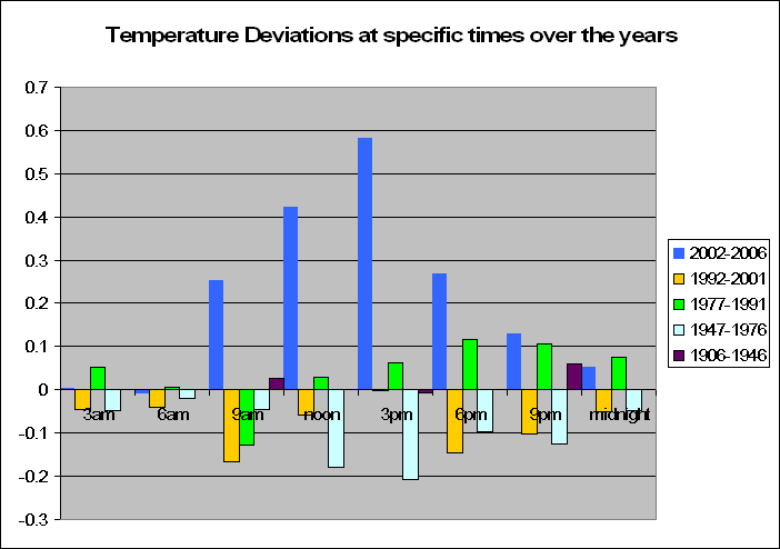
The graph to the left shows the deviations from the norm at certain times of the day with reference to last 5 years, 15, 30, 60 and 100 years. Data for the last 100 years was only available for 9am, 3pm and 9pm.
Lets look at the last 5 years to start off with. At the heat of the day, at around 3pm, we see that temperatures in the last 5 years have increased by on average almost 0.6 degrees. But interestingly, at other times of the day, the decrease is less. In fact at 3am and 6am, when the sun does not shine, there is no increase at all in temperature. As the earth spins further away from the sun, the temperature deviation from the norm decreases. Between 1992 and 2001 we had less than normal temperatures with the exception of 3pm. The previous 15 years before that showed an increase in temperatures at around the 6pm to 9pm mark, and from 1947 to 1976, where it is well known that maximum temperatures were on the decrease, this graph shows this. With temperatures at what would normally be at the peak, 3pm, being around 0.2 degrees below the norm. Interestingly here, that when the sun is on the other side of the world, the temperature difference is minimal.
So why is it that in most recent times, we are heating up during the heat of the day and not at other times? Admittedly it is only a small sample size of 5 years, but it might well be worth some debate. This data clearly proves, that Australia is not uniformly heating up at all times, but only when the sun is at its peak. Hence the reason why we get increased maximum temperatures more recently.
It is interesting, that the increased maximum temperatures of late only occur because of an increasing temperature around 3pm (the heat of the day) and not at other times. Likewise the decreased maximum temperature from around 1947 to 1976 only occurred because of a decrease in temperatures around 3pm (the heat of the day) and largely not at other times.
If CO2 were the primary causer of increased temperatures in Australia, then wouldn’t we get a more consistent temperature increase throughout the day and night? Analysis at certain times of the year, and when there is/isn’t cloud cover might well be the key here.
Keep in mind however, that the increase in temperature over the past 5 years is not significant, but is still worth a look into, as it seems this is rarely done in the literature.
So what is happening in these last few years of increase in maximum temperatures? It is strange that research has not decided to look into this, and has generally just accepted the fact that we are warming up.

The graph to the left shows the deviations from the norm at certain times of the day with reference to last 5 years, 15, 30, 60 and 100 years. Data for the last 100 years was only available for 9am, 3pm and 9pm.
Lets look at the last 5 years to start off with. At the heat of the day, at around 3pm, we see that temperatures in the last 5 years have increased by on average almost 0.6 degrees. But interestingly, at other times of the day, the decrease is less. In fact at 3am and 6am, when the sun does not shine, there is no increase at all in temperature. As the earth spins further away from the sun, the temperature deviation from the norm decreases. Between 1992 and 2001 we had less than normal temperatures with the exception of 3pm. The previous 15 years before that showed an increase in temperatures at around the 6pm to 9pm mark, and from 1947 to 1976, where it is well known that maximum temperatures were on the decrease, this graph shows this. With temperatures at what would normally be at the peak, 3pm, being around 0.2 degrees below the norm. Interestingly here, that when the sun is on the other side of the world, the temperature difference is minimal.
So why is it that in most recent times, we are heating up during the heat of the day and not at other times? Admittedly it is only a small sample size of 5 years, but it might well be worth some debate. This data clearly proves, that Australia is not uniformly heating up at all times, but only when the sun is at its peak. Hence the reason why we get increased maximum temperatures more recently.
It is interesting, that the increased maximum temperatures of late only occur because of an increasing temperature around 3pm (the heat of the day) and not at other times. Likewise the decreased maximum temperature from around 1947 to 1976 only occurred because of a decrease in temperatures around 3pm (the heat of the day) and largely not at other times.
If CO2 were the primary causer of increased temperatures in Australia, then wouldn’t we get a more consistent temperature increase throughout the day and night? Analysis at certain times of the year, and when there is/isn’t cloud cover might well be the key here.
Keep in mind however, that the increase in temperature over the past 5 years is not significant, but is still worth a look into, as it seems this is rarely done in the literature.
Thursday, November 16, 2006
Random Patterns?
Let’s do a little test today. Ok below we have 2 graphs. One of them has been derived by random numbers and is purely random, the other is not. Can you guess which graph is purely random, the first graph or the second?
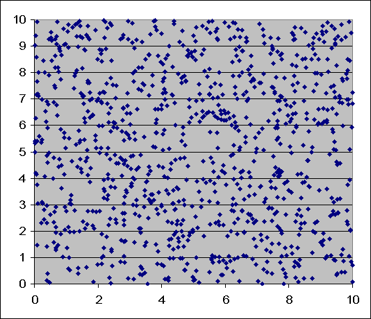
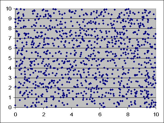
Basically this outlines one of the key notions in statistical analysis. It is very easy, especially for an untrained eye to find patterns in randomness. When we look at the first graph we see patterns, we see little stretches of cluttered dots, some areas where no dots actually appear. If we look hard enough, we can come to some conclusions about what is happening in this graph. If we look at the second graph, we see not a lot of clusters. The dots are very evenly spread and not many big gaps.
An untrained eye would immediately say that the second graph is random, when in fact the opposite is true. The first graph is random. It is very easy to find patterns in randomness. It occurs today in global warming. When we have one of the hottest days on record, or when we have severe storms. We might look at the last couple of years and say that there’s been a drought, or temperatures have increased, there isn’t much rainfall.
But statisticians prove whether this is due to outside causes, or whether this is purely random variation. The only way to do this, is to analyse the data and use statistical tests. This is the only way to prove why we are having changes that we are having now.
Sure we are going to get some hot days, some cold days, some blizzard snow days and some stinking hot days. But is this change in the weather due to global warming? The only way to find out, is not to hypothesise and simply say “it must be, I can’t remember such strange weather” as so many people seem to be doing, but rather analyse the data, see if this strange weather is any different from the norm or if it is purely just random variation.
Only a statistician can prove whether the weather is statistically significantly different now or whether it’s just natural variation. So when an article or scientists tells you that temperatures have significantly increased, or that cycles are more common now that previous, or that temperatures are so cold and warm and everywhere now, ask for a p value. If they don’t have one, or don’t know what you are talking about, then they simply have either not done the research to back up their claims or they, like it seems every other untrained number cruncher, are simply finding patterns in randomness.
Tuesday, November 14, 2006
Consistent Macquarie
Macquarie Island is an island half way between Australia and the Antarctic. It is officially according to the ABM part of the great ice continent. So why not do some analysis on that. We have luckily this time, temperature data at certain times of the day, and instead of littering a post with 10 graphs I shall merely put links there for them.
And here they are. Temperature deviations from the average for the times of midnight, 3am, 6am, 9am, noon, 3pm, 6pm and 9pm.
Whist the data only goes from the 1960’s, we do see a pattern amongst the data. It seems that in the years 1963 to 1973 we had a less than average mean monthly temperature. From the years 1977 to 1989 the temperature was on average 0.3 degrees greater than average. And since then it has been up and down.
What is more interesting is the extreme similarity amongst the graphs. I had to even check twice to make sure that the data was correct and that they were actually not graphing the same information. They weren’t, and what this means is that the temperature deviations year to year at different times at Macquarie Island stay relatively constant. In that, in a certain year if we were to experience an increase in 0.5 degrees at 3pm, then there is a reasonable chance that we would experience a similar increase at 3am and 9pm and noon etc.
This is very interesting, and we will dwell more on this in the future, by looking at season patterns. But what this means is that something is actually making the temperature change at a constant rate throughout the day and year. Of course, this something is not increasing the temperature however. All test on the data proved that there was no significant increase or decrease in temperature (midnight F = 0.87, p = 0.355; 3am F = 0.63, p = 0.43; 6am F= 0.47, p = 0.5; 9am F = 1.46, p = 0.23; noon F = 1.72, p = 0.09; 3pm F = 3.32, p = 0.75; 6pm F = 2.44, p = 0.13; 9pm F = 0.97, p = 0.33)
Hypocritical Channel 7
As pointed out by Tim Blair, the Sunrise show on channel 7 are running a global cooling campaign. However rather hypocritically, they have plenty of global warming prizes to give out which include:
A 4WD Nissan Murano, flights to the US to see Jerry Seinfeld perform,$6000 plasma televisions, New York family holidays, race laps at Bathurst, touring Australia with INXS, weekend flights to Melbourne, a flight to London to see Madonna in concert, a flight to Germany for the World Cup, family flights to New Zealand,flights to destinations around Australia, Queenstown and London.
I guess they don’t want to give up the good to get rid of the bad.
Monday, November 13, 2006
The best way to spend godzillions
Paul Driessen, author of Eco-Imperialism: Green power, Black Death, rages against what he rightly calls the “the real climate catastrophe”:
Over 2 billion of the Earth’s citizens—including 95 percent of Africans—still do not have electricity. That means no lights, refrigerators, stoves, radios, televisions or computers; no modern homes, hospitals, schools, offices or factories. Instead, people breathe polluted smoke from wood and dung fires, and die by the millions from lung diseases.
The world should be rushing to their aid. Instead, in the name of preventing hypothetical climate change, environmentalists and rich countries oppose fossil fuel power plants in poor countries. To “protect wild rivers,” they obstruct hydroelectric projects. They resist nuclear power, on the ground that it is “inherently dangerous.” In short, they are telling a third of the world’s people:
“You cannot have modern, healthy, industrialized societies. Your only option is piddling amounts of expensive, unreliable electricity from wind and solar. To safeguard the world from speculative risks that we are concerned about, you must endure life-threatening dangers that perpetuate poverty, disease and childhood death in your destitute nations.”
I totally agree. How the Stern report can recommend spending godzillions of fixing global warming, which may/may not exist (it doesn't in Australia and parts of Antarctica), humans may not be the cause, and if they are might not be able to make a difference - whilst there are millions of starving, uneducated, malnourished people in Africa, is criminal.
How the Sterm report suggests to spend billions to stop global warming so that more people don't die in Africa is a joke. Moreso, it's beyond a joke.
Sunday, November 12, 2006
Getting rich by spreading doom
Maybe I'm on the wrong side of the debate, but climate scientist and large doomsday preacher Tim Flannery, made a cool $150k from selling his book about how we are all going to die.
Friday, November 10, 2006
Cold Antarctica is still very cold
A new British research team has concluded that
Mass gains from accumulating snow, particularly on the Antarctic Peninsula and within East Antarctica, exceed the ice dynamic mass loss from West Antarctica. The result exacerbates the difficulty of explaining twentieth century sea-level rise.
This of course is very interesting to me, and we do have some data from some Australian stations out on the cold continent. So lets see analyse the data from there. Mawson is a place named after Australian explorer Sir Douglas Mawson. Unfortunately they only have max and min data down there, and whilst I hate analysing data where the time isn’t kept constant, we shall give it a go anyway.
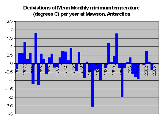 The graph on the left shows deviations from the average minimum temperature at Mawson from 1954. Tests prove no significant increase or decrease (F = 2.22, p = 0.14). And the graph below shows deviations from the average monthly maximum temperature, of which tests again show no significant increase or decrease (F = 0.07, p = 0.79).
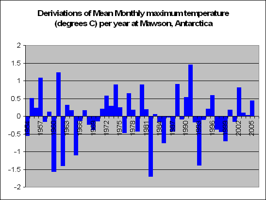
So there is little wonder why the ice is increasing at Antarctica. Admittedly, this is only one station on the whole continent, so we can probably only conclude that around the Mawson side of Antarctica, it’s not heating up, which backs up the British survey’s results.
So don’t worry too much peoples, looks like there will still be a few more march of the penguins documentaries to come out in the future.

Mass gains from accumulating snow, particularly on the Antarctic Peninsula and within East Antarctica, exceed the ice dynamic mass loss from West Antarctica. The result exacerbates the difficulty of explaining twentieth century sea-level rise.
This of course is very interesting to me, and we do have some data from some Australian stations out on the cold continent. So lets see analyse the data from there. Mawson is a place named after Australian explorer Sir Douglas Mawson. Unfortunately they only have max and min data down there, and whilst I hate analysing data where the time isn’t kept constant, we shall give it a go anyway.
 The graph on the left shows deviations from the average minimum temperature at Mawson from 1954. Tests prove no significant increase or decrease (F = 2.22, p = 0.14). And the graph below shows deviations from the average monthly maximum temperature, of which tests again show no significant increase or decrease (F = 0.07, p = 0.79).
So there is little wonder why the ice is increasing at Antarctica. Admittedly, this is only one station on the whole continent, so we can probably only conclude that around the Mawson side of Antarctica, it’s not heating up, which backs up the British survey’s results.
So don’t worry too much peoples, looks like there will still be a few more march of the penguins documentaries to come out in the future.

Thursday, November 09, 2006
The punchline
Sorry, just incase you didn't understand my conclusion to my other post, I thought I'd summarise:
Australia is not warmer now than it was in the past at 3am, or 6am or 9am or noon or 3pm or 6pm or 9pm or midnight. The stats prove that at all of these times, Australia has not got significantly warmer.
Hence it would seem therefore, that global warming is not a problem in Australia. Thankyou

Australia is not warmer now than it was in the past at 3am, or 6am or 9am or noon or 3pm or 6pm or 9pm or midnight. The stats prove that at all of these times, Australia has not got significantly warmer.
Hence it would seem therefore, that global warming is not a problem in Australia. Thankyou

Antarctica's getting bigger, even
New research has found that Antartica's ice is getting even thicker. So much for rising sea levels. And what we'll find soon is my analysis of Antartica's temperatures. Who says my analyis is only Australia Based!
Australia just aint warming up....at all!
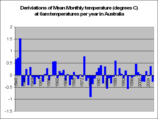
Well the graph on the left shows the deviation from the norm for temperatures at 6am, and surprise surprise, there was no significant increase (F=1.25, p=0.22). In fact we might as well show all the other times now, because there seems to be a pattern amongst all of Australia’s times in that the temperature is not changing.
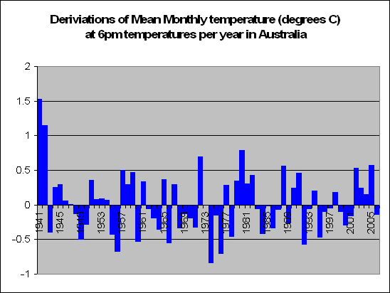 The graph on the left shows temperatures at 6pm. No significant increase in temperature found (F=0.47, p = 0.5).
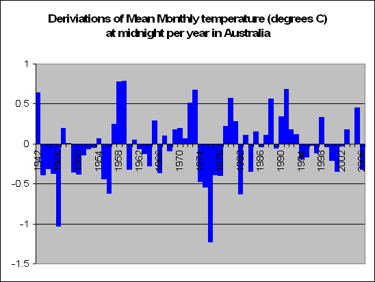
This next graph shows temperatures at midnight, where no significant increase was found (F=1.3, p = 0.26), and the graph below shows the temperatures at noon where, once again no significant difference was found (F=2.44, p = 0.12). One can observe the last few years in the noon graph that are above normal, (although not significantly above normal). This matches what we found at 3pm as well. And so it seems, although insignificantly, that we have had a few years of late with increased temperatures around the noon to 3pm mark – basically the heat of the day. This would also indicate why we have had increased maximum temperatures during this time.
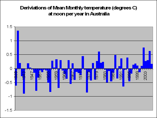
It seems strange that only in the last 5 years or so, this is the only time that we have seen an increase. Although I stress once again, that the increase is insignificant, but still might be worth talking about. If global warming were true, then surely we would see a general increase over the full 24 hours. Please tell me if I’m wrong here.
However a recent increase from noon to 3pm – the heat of the day, when the sun is shining at it’s best, suggests to me that there could be more into this than what we first thought. Could the sun possibly be hotter? Is solar radiation related to these increased temperatures? What happens when we have cloud cover? Do we see these increases in temperatures between noon and 3pm when there are clouds? All this will be looked at in detail.
Wednesday, November 08, 2006
Stable 3am temperature
3am, where you experience this time only when you've had a very big night.
But has it got colder or warmer at this time?
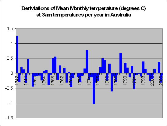 Well the graph on the left proves that it, err, hasn’t changed. Our statistical tests prove no significant increase or decrease either (F = 0.20, p = 0.65).
So no increase at 3am, 9am, 3pm and 9pm. Hmm, I sense a trend. Maybe tomorrow we will find an increase when we look at 6am
But has it got colder or warmer at this time?
 Well the graph on the left proves that it, err, hasn’t changed. Our statistical tests prove no significant increase or decrease either (F = 0.20, p = 0.65).
So no increase at 3am, 9am, 3pm and 9pm. Hmm, I sense a trend. Maybe tomorrow we will find an increase when we look at 6am
Monday, November 06, 2006
No rise in temperature when the sun goes down
Ok going to the race that stops the nation, the Melbourne cup tomorrow, so I thought I’d give tomorrow’s update a little early.
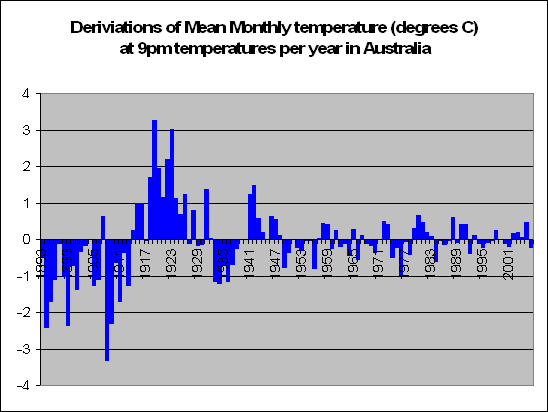 9pm. Ok the graph on the left has all the deviations from the norm of temperatures recorded at 9pm. What we can obviously see at the start is big negative deviations up until abut 1915 and then big positive deviations till about 1930, then smaller negative, smaller positive. Hmm. We will talk about accuracy of data later on, but it seems there is a lot more variability in the earlier recordings.
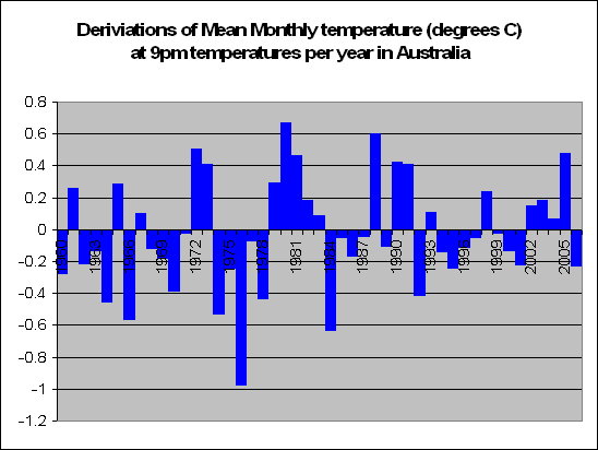 Therefore the graph now on the left has deviations from temperatures at 9pm from 1960 onwards. Can you see a pattern? I can’t. Couple of cold years, couple of warm. In the end we have to conclude that there is no statistical evidence that Australia is warmer or colder than it was 60 years ago at 9pm (F = 1.50, p = 0.227).
So therefore is Australia hotter now at 9am than it was in the past? No. Is Australia hotter now at 3pm than it was at the past? Hmm…No. Is Australia hotter now at 9pm than it was in the past? Hmm…still no. So when, if any was Australia actually hotter? We’ll have a look at 3am on Wednesday.
 9pm. Ok the graph on the left has all the deviations from the norm of temperatures recorded at 9pm. What we can obviously see at the start is big negative deviations up until abut 1915 and then big positive deviations till about 1930, then smaller negative, smaller positive. Hmm. We will talk about accuracy of data later on, but it seems there is a lot more variability in the earlier recordings.
 Therefore the graph now on the left has deviations from temperatures at 9pm from 1960 onwards. Can you see a pattern? I can’t. Couple of cold years, couple of warm. In the end we have to conclude that there is no statistical evidence that Australia is warmer or colder than it was 60 years ago at 9pm (F = 1.50, p = 0.227).
 So therefore is Australia hotter now at 9am than it was in the past? No. Is Australia hotter now at 3pm than it was at the past? Hmm…No. Is Australia hotter now at 9pm than it was in the past? Hmm…still no. So when, if any was Australia actually hotter? We’ll have a look at 3am on Wednesday.
Perfect Beach Weather on a Sunday Afternoon
So how was your weekend? Was a bit chili down in Melbourne, but that’s what it’s famous for – the cold and a large variability of weather, not just long term, but also in the one day.
But what about at 3pm?
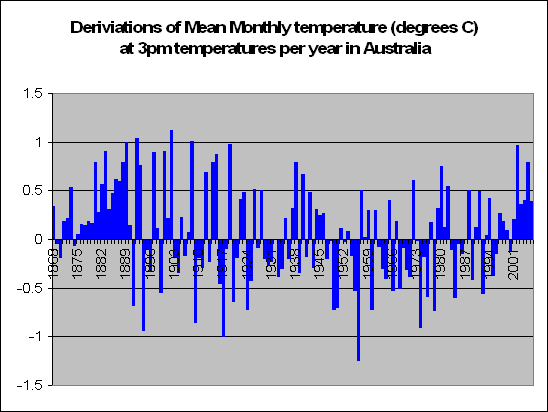 The graph on the left shows Australia’s deviations from the average for temperatures taken at 3pm. It shows some interesting things. We had a big hot spell from 1875 to 1890 and have also had a recent increase in temperature in the last 5 yeas. All the time in between suggests no increase or decrease in temperature. This is confirmed with statistical analysis that there has been no significant increase or decrease (F = 3.41, p = 0.067). Interesting, that is wasn’t far off proving a long term decrease in temperature. Even if we have just the data from 1910 we still see no significant increase. (F = 0.81, p = 0.42). So at 3pm temperatures are not increasing. In fact the early and recent increases matches our analysis of Australian wide maximum temperatures which would occur at about the 3pm time in some parts of Australia.
Hey but what about the recent increases, doesn’t that prove that we are warming up? Indeed, it looks as though we have warmed at 3pm Australian wide by on average about 0.5 of a degree. But this can be attributed simple to random variation. Co2 levels were not what they are now in the 1880s, and even should we choose to ignore such old data, we still proved with a statistical test, that there is no evidence that temperature has increased significantly.
So lets recap. Have Australia’s temperatures significantly increased at 9am? No. Have Australia’s temperatures significantly increased at 3pm? No. So so far we conclude that Australia just isn’t heating up at all. 9pm data tomorrow
But what about at 3pm?
 The graph on the left shows Australia’s deviations from the average for temperatures taken at 3pm. It shows some interesting things. We had a big hot spell from 1875 to 1890 and have also had a recent increase in temperature in the last 5 yeas. All the time in between suggests no increase or decrease in temperature. This is confirmed with statistical analysis that there has been no significant increase or decrease (F = 3.41, p = 0.067). Interesting, that is wasn’t far off proving a long term decrease in temperature. Even if we have just the data from 1910 we still see no significant increase. (F = 0.81, p = 0.42). So at 3pm temperatures are not increasing. In fact the early and recent increases matches our analysis of Australian wide maximum temperatures which would occur at about the 3pm time in some parts of Australia.
Hey but what about the recent increases, doesn’t that prove that we are warming up? Indeed, it looks as though we have warmed at 3pm Australian wide by on average about 0.5 of a degree. But this can be attributed simple to random variation. Co2 levels were not what they are now in the 1880s, and even should we choose to ignore such old data, we still proved with a statistical test, that there is no evidence that temperature has increased significantly.
So lets recap. Have Australia’s temperatures significantly increased at 9am? No. Have Australia’s temperatures significantly increased at 3pm? No. So so far we conclude that Australia just isn’t heating up at all. 9pm data tomorrow
Friday, November 03, 2006
Walk Against Warming
Australia are officially walking against warming on Saturday.
I argue that a bit of research might actually do them better. Maybe for instance....reading this blog perhaps....
I argue that a bit of research might actually do them better. Maybe for instance....reading this blog perhaps....
The Evil Australia
The Age reports that:
AUSTRALIA'S emissions of greenhouse gases are the highest per capita in the Western world — apart from tiny Luxembourg — and have grown by 1.5 tonnes a head since 1990
Well as the article below proves, lucky this has no effect on Australian temperatures. Phew!
AUSTRALIA'S emissions of greenhouse gases are the highest per capita in the Western world — apart from tiny Luxembourg — and have grown by 1.5 tonnes a head since 1990
Well as the article below proves, lucky this has no effect on Australian temperatures. Phew!
I hate cold mornings
Well the last few days we’ve concluded that Australia’s mean monthly maximum temperatures are increasing of late, but nothing significantly different from the norm. The mean monthly temperatures more than 100 years ago were greater than now. On the counter side we also showed that mean monthly minimum temperatures have increased of late. We have seen an increase of 0.27 degrees C in the last 30 years. However it looks as though this increase has not continued to increase in the last 30 years and has remained relatively constant. The reason for this increase in 0.27 degrees at around the mid 1970s mark, is undetermined.
However it makes a lot of sense to take measurements at a certain time and compare them. By keeping the time constant we can see if 6pm 50 years ago was colder than 6pm now, or whether 9am 100 years ago was hotter or colder than it is today. If global warming is happening in Australia, and the place is hotting up, then we would expect, especially in the last 20-50 years a significant increase in this variable.
So shall we test it out? The next 8 days, yep the next 8, will be an article each day looking at the variation in temperatures at certain times of the day. These times are: Midnight, 3am, 6am, 9am, noon, 3pm, 6pm and 9pm. A fairly broad range obviously.
ABMs data has taken measurements at these times from ages back. 9am and 3pm temperatures were recorded from when temperature recordings first started (mid 1800s), 9pm recordings started from about 1890 and all other temperatures were unfortunately only recorded from as late as 1940. Nevertheless, we shall analyse them all.
And what better way to start, than the times with the most data: 9am and 3pm. Lets check the earlier time to start off with.
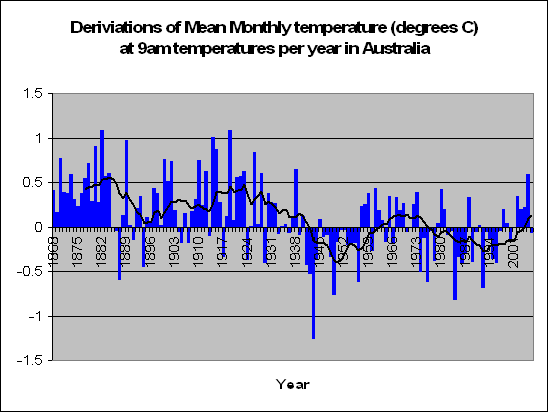
On the left is a graph of Australia’s deviation from the average of temperatures recorded from all over Australia at 9am in the morning. Times are obviously adjusted for day light savings. And what can we conclude from this? It seems that the times between 1860 all the way up to 1940 recorded on average greater than normal temperatures. Then we had 25 years of really cold start work times, followed by a period of 25 years of slightly warmer wake up calls, another 25 years of chilling turn the electric blanket on temperatures, and apart from last year, we had 4 years in a row of temperatures about 0.2 degrees greater than norm at 9am in the morning.
Now I’m pretty sure that I don’t have to do a statistical test of this analysis to prove scientifically if there has been a statistically significant increase or decrease in temperature. I won’t bother. We all know the result from looking at the graph. We’ve had a bit of cold, a bit of warmth, a bit of cold, a bit of warmth. The pattern seems even cyclic if anything. But either way, what we are witnessing here, is proof that Australia’s temperatures, at least at 9am in the morning, have not increased at all. Global warming, and human induced CO2 levels, have no influence whatsoever on the temperature at this stage of the morning.
Which to be honest, is a little upsetting. I hate cold mornings.
However it makes a lot of sense to take measurements at a certain time and compare them. By keeping the time constant we can see if 6pm 50 years ago was colder than 6pm now, or whether 9am 100 years ago was hotter or colder than it is today. If global warming is happening in Australia, and the place is hotting up, then we would expect, especially in the last 20-50 years a significant increase in this variable.
So shall we test it out? The next 8 days, yep the next 8, will be an article each day looking at the variation in temperatures at certain times of the day. These times are: Midnight, 3am, 6am, 9am, noon, 3pm, 6pm and 9pm. A fairly broad range obviously.
ABMs data has taken measurements at these times from ages back. 9am and 3pm temperatures were recorded from when temperature recordings first started (mid 1800s), 9pm recordings started from about 1890 and all other temperatures were unfortunately only recorded from as late as 1940. Nevertheless, we shall analyse them all.
And what better way to start, than the times with the most data: 9am and 3pm. Lets check the earlier time to start off with.

On the left is a graph of Australia’s deviation from the average of temperatures recorded from all over Australia at 9am in the morning. Times are obviously adjusted for day light savings. And what can we conclude from this? It seems that the times between 1860 all the way up to 1940 recorded on average greater than normal temperatures. Then we had 25 years of really cold start work times, followed by a period of 25 years of slightly warmer wake up calls, another 25 years of chilling turn the electric blanket on temperatures, and apart from last year, we had 4 years in a row of temperatures about 0.2 degrees greater than norm at 9am in the morning.
Now I’m pretty sure that I don’t have to do a statistical test of this analysis to prove scientifically if there has been a statistically significant increase or decrease in temperature. I won’t bother. We all know the result from looking at the graph. We’ve had a bit of cold, a bit of warmth, a bit of cold, a bit of warmth. The pattern seems even cyclic if anything. But either way, what we are witnessing here, is proof that Australia’s temperatures, at least at 9am in the morning, have not increased at all. Global warming, and human induced CO2 levels, have no influence whatsoever on the temperature at this stage of the morning.
Which to be honest, is a little upsetting. I hate cold mornings.
Thursday, November 02, 2006
I love a barmy night
Whilst there is insufficient evidence to prove that we are warming up during the day, there is good evidence to prove that our nights are getting warmer.
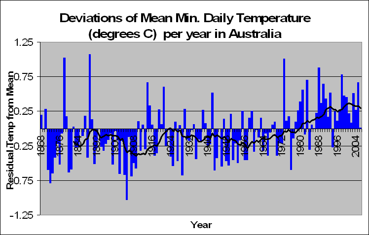
Given on the left is the average monthly Minimum temperature deviations from the norm. We had some pretty freezing nights from 1870 to 1910 and some pretty average nights up until the mid 1970s. After that the minimum time shot up about 0.27 degrees until now.
Global Warming advocates will prove this as evidence for global warming, and indeed it does look as though Australia’s minimum temperatures are in fact warming up. What is interesting (despite the moving average), of the sudden increase in temperature at the mid 1970s. From 1970 to current, there has been no statistically significant increase in temperature (F = 0.87, p = 0.357). This might well be because the data set of 30 years is pretty small, but it also might be because the average monthly minimum temperature in Australia is not increasing from when it shot up in the mid 1970s. Whether or not increased night temperatures will have any influence on crops and all the problems that global warming alarmists say, I’m not sure. But personally I welcome a warmer night, well as long as I don’t live near the equator!
We will go more in depth, looking at states, and individual stations with regards to the mean monthly maximum and minimum graphs given here. But firstly I want to ask you, despite these two graphs, and the fact that these are the same and only types of graphs that the ABM use to prove an increase in temperature, are these the correct way to see if Australia is warming up?
Most people would say yes, what are the other options? Well let me give you an example. Suppose we wanted to compare two days and see which one was hotter. We take temperature readings every hour. We could compare the two smallest minimum temperatures readings and the two maximum temperature readings to see which is hotter. Or we could compare what the temperature was at the same time of the day between the two. Eg, which day was hotter at 3pm, and at 9am, and at 1pm?
If we keep the variable constant as to the time that we take the measurements, then we will get a lot better understanding as to which day was actually hotter. Can we do this with Australian temperature data? You bet.
A challenge to Journalists
Environment and Public Works Chairman James Inhofe gave a speech on the Senate floor taking to task global-warming alarmists and their enablers in the media.
Wednesday, November 01, 2006
Stopping Global Warming Will Save Millions
The Stern report outlines what the Earth's goals are for the future. These include amongst others: Halve extreme poverty and hunger, Reduce under five mortality, Reduce maternal mortality and Reduce aids.
What better way to do this then spend godzillions on the theory of global warming which has not yet been scientifically proven beyond doubt. And that
there could be an additional 165,000 to 250,000 child deaths per year in South Asia and sub-Saharan Africa by 2100.
Wow that's huge. I'm not sure where he got his numbers from but here are mine. Well lets consider that when sponsoring a child in Africa, it costs us about a dollar a day to give the child food, education and medicine. Not much hey, $400 a year only. Given that Junk Science claim that global warming has cost at this stage about $256 billion, this equates to clothing, educating and feeding 640 million kids for a year, or 7 million people every year from the age of 1 up to 94.
So would you rather spend godzilions on a possibility of global warming that may or may not be advantageous, or feed, cloth, educate and strip of disease the poor of Africa and Asia?
Niagra Falls Mist Due to Global Warming
Wikipedia, the source of 100% factual scientific theory...hmmm....says that a possible cause for the increased mist surrounding the Niagra Falls is global warming. What the?
Australia's Maximum Temperatures are not at Maximum
Ok so here is the first piece of analysis on Australian temperatures that I have done. There is plenty more to come, but this I am sure will spark a reasonable about of debate:
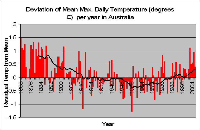
Given on the left is Australia’s Deviation form the mean of Average Monthly Maximum Temperatures. The pattern in it is startling and obvious. Since 1868 we have had a decreasing maximum temperature in Australia. This trend continued to decrease until about 1960, and from then until about the year 2000 the temperature remained relatively constant. It is quite clear from this graph why scientists in the 60s and 70s were warning of the earth possibly going into another ice age. If temperatures kept decreasing then who knows what might happen.
Fortunately it didn’t, and the next 30 years so an evening out process where maximum temperatures were scattered around the mean. What is certain, is that the past 5 years have seen a higher maximum temperature than normal, around 0.7 degrees higher. But this is of course only 5 years. The heatwaves of 1875 to 1886 recorded 0.9 degrees above normal over 12 years. 8 years of heat from 1895 to 1907 produced 0.6 degrees above normal on average. Just after the second world war we had 12 years in a row of lower than average maximum temperatures.
Such departures from the mean are in fact normal and occur largely due to random variation. If the increase in temperatures in the past 5 years is due to human CO2 activity, then how were the temperatures pre 1900 just as hot if not hotter? The cyclic nature of this graph seems to be obvious, although it must be noted that there is not enough data to prove that statistically.
It is quite true, that from around 1950 temperatures have been increasing. So much so, that if one only had the data in the last 60 years there would be ample evidence that we are in a hotting up Australia. But with more data, comes more evidence.
What is interesting is the graphs that the ABM give. They for starters don’t show a decreasing temperature trend from 1910 to 1960. There is a lot of scientific evidence out there that the decrease in temperature was pretty global and there were a lot of fears that we were entering a stage of global cooling. Why doesn’t the ABM graph show this? Mine does!
There are two reasons why I can guess that the ABM have only data from 1910, when their records go as far back as the mid 1800s. The first is obvious. I’ve proven that the mean maximum temperatures at this time were even hotter than today. Why would the ABM want to show this? This would prove that humans are not the cause of global warming and it is just a normal natural variation. The other reason might be that they conclude that the earlier data was not very reliable.
My analysis suggest that as well, that the years from 1858 to 1868 is very unreliable data, but from then on, it is very comparable with today’s (more on that later). So given it’s reliability I have to go back to my original claim that the ABM don’t want to show the world that Australia was once hotter than it is today.
My opinions and analysis is totally unbiased. So much so that I will in fact give evidence for a warming up Australia tomorrow when we look at average minimum temperatures. But one thing is for sure form this analysis, that humans are not the cause of increased average maximum temperatures in Australia. Period.
The Analysis
Ok I know, this article will be really boring, but potentially it is one of the most important. Basically all I’m writing here is how I got the data, and how I did my analysis. It’s important because I want to tell people about the unbiasedness of my work. It is also important so that should someone want to replicate what I did to prove that I was honest/dishonest, then they can do so and I encourage people to do so. This is the best part of science. So if you are interested in how the analysis was done, then read on, otherwise the next post will have the first stage of some of the results.
Data is taken from the Australian Bureau of Meteorology (ABM). The ABM divide Australia into a number of rainfall districts as shown here
For our analysis we took one weather station from each district. The chosen weather station was one that had weather predictions up to the current date and also had results that went back the furthest in time. This resulted in 102 weather stations in total. On occasions, where a certain long lasting weather stations stopped and another one took its place on the previous stations ending, both stations were taken in the sample. The analysis however in this instance still treats these two stations as two independent weather stations, and analysis is done separately on both.
Following this, weather stations on islands and the 2 stations on Antarctica were removed from the sample as it was estimated that they might not represent Australia as accurately as possible. Due to information regarding urban heating, stations that had approx. 100,000 people or more were removed from the sample as well, and we were left with 82 weather stations around Australia to use.
From each these stations the average monthly temperature (or rainfall etc.) was calculated from the time the measurements started until current. Hence we have different average temperatures per month per station (eg. The average temperature in KALUMBURU in January, the average temperature in KALUMBURU in February etc.).
From these averages we calculated the deviations from the mean for every month of every year for each station. These were then summed to get the average deviation from the mean for every station for every year. The average deviation for all stations was then recorded and this is shown in the graphs and analysis. Variables at this stage included in the analysis are Average Maximum and Minimum Temperature, Aver Temperature at 9am and 3pm, and Average Rainfall per month.
ANZ: Poor Money Management
John McFarlane is a typical community member. A member who wants to do their part in society. To help the world as we know it today and to make to make it ideal for the generations of people he will never see in the future. But he makes one critical mistake in his write-up, something which makes his entire article completely irrelevant, and that is his first sentence:
While the debate among scientists about climate change continues
In other words, he admits (there are few that do so), that scientists are unsure if humans are the cause of global warming, that scientists are unsure if a warming of the planet might be good for us or bad, that scientists are unsure if our greenhouse gasses are warming the planet or if it’s due to natural causes, or even if the globe is warming at all.
But that still doesn’t deter John McFarlane. With no scientific proof whatsoever that our actions will make any difference (either good or bad), he suggests that we should not wait till “conclusive proof” to act. That’s right, we should spend billions of dollars on a hunch. Something that might not be right, might not have an effect, and even if it did, the effect might be even advantageous.
Given that the debate could swing either side due to lack of evidence, there is a significant chance that global warming is not hyped up to what some say it to be. If so, are you, John McFarlane, going to take the blame for the thousands of starving dead in Africa, for example, who’s billions of dollars wasted on global warming could have saved? I agree with you that we should act now, but I also think that we should act on the now. We should focus on today’s problems where our money can be spent rather than spending every penny of it on a scientifically unproven, debatable phenomenon that not even our children’s children will likely see any effects. Does it make sense to spend billions of dollars on the off chance that our offspring 250 years down the track might live a better life, when at the moment thousands are dying from malnutrition?
Whilst I admire John McFarlane’s leadership and commitment to help the planet and make it a better place for countless generations to come, his decision to be part of the movement to spend billions of dollars (which could be better spent elsewhere) on something that has limited scientific justification is what every ANZ financial risk advisor would classify as poor money management.
Tuesday, October 31, 2006
More Rain in the Wet, Less Rain in the Dry?
We proved on Friday that Australia, despite what many are saying is the worse drought on record, is far from it. Australia’s rainfall has been pretty constant over the years.
In fact, the ABM actually agree with us as well:
http://www.bom.gov.au/lam/climate/levelthree/climch/clichv4.htm
Because of the large year-to-year changes it is hard to detect any long-term trends in Australian rainfall.
But continue on saying:
However, some weak trends in rainfall have been identified. The percentage area of Australia experiencing extreme wet conditions has increased slightly this century while the area of extreme dryness has reduced.
Ahh, so despite the fact that global warming isn’t making Australia dryer, it’s climate change that is making the dryer places more dry and the wetter places more wet. Now we get you. So where’s the proof of this? Hmm…looks like there is none. If I remember correctly, their “weak trend” in regards to cyclones was proven non significant.
So where’s the proof of this? ABM don’t provide it, but using their own statistics, I decided to test it. From our sample we took the 5 most driest places in Australia, and the 5 most wet. These were as follows:
Most driest: MARREE (SA), WOOMERA (SA), CARNARVON (WA), TIBOOBURRA (NSW), MEEKATHARRA (WA).
Heard of them? No, that’s why no one lives there. There’s no water to flush the toilet.
Most Wet: COFFS HARBOUR (NSW), DARWIN (NT), BYRON BAY (NSW), THREDBO (NSW), CAIRNS (QLD).
Great places to Ski, surf, and well, wrestle with crocodiles.

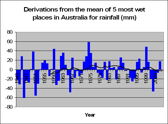
And the results are the following two graphs for the most driest and most wet. To be honest. I can’t see any pattern whatsoever. But let’s test it anyway. Tests prove, that there is no significant increase or decrease in rainfall in the 5 most wet places in Australia (F = 0.66, p = 0.421) and there is also no significant increase or decrease in the amount of rainfall in the 5 driest places in Australia either (F = 1.37, p = 0.244).
So how did the ABM come to these conclusions that the dry is drying up and the wet is wetting up? Either they have terrible statisticians working for them (lets hope not), or they want to prove that climate change is, in fact, changing. I mean, there’s so much hype about it recently, that it’s possibly in the ABM’s best interests to prove that their work is ultra-important.
So why not claim that Australia’s rainfall patterns are changing more recently? Why not claim that because of this global warming results and humans are to blame? Why not claim that we have to act now or human civilization will be lost forever?
Why not? Because it all, quite possibly, could not be true.
In fact, the ABM actually agree with us as well:
http://www.bom.gov.au/lam/climate/levelthree/climch/clichv4.htm
Because of the large year-to-year changes it is hard to detect any long-term trends in Australian rainfall.
But continue on saying:
However, some weak trends in rainfall have been identified. The percentage area of Australia experiencing extreme wet conditions has increased slightly this century while the area of extreme dryness has reduced.
Ahh, so despite the fact that global warming isn’t making Australia dryer, it’s climate change that is making the dryer places more dry and the wetter places more wet. Now we get you. So where’s the proof of this? Hmm…looks like there is none. If I remember correctly, their “weak trend” in regards to cyclones was proven non significant.
So where’s the proof of this? ABM don’t provide it, but using their own statistics, I decided to test it. From our sample we took the 5 most driest places in Australia, and the 5 most wet. These were as follows:
Most driest: MARREE (SA), WOOMERA (SA), CARNARVON (WA), TIBOOBURRA (NSW), MEEKATHARRA (WA).
Heard of them? No, that’s why no one lives there. There’s no water to flush the toilet.
Most Wet: COFFS HARBOUR (NSW), DARWIN (NT), BYRON BAY (NSW), THREDBO (NSW), CAIRNS (QLD).
Great places to Ski, surf, and well, wrestle with crocodiles.


And the results are the following two graphs for the most driest and most wet. To be honest. I can’t see any pattern whatsoever. But let’s test it anyway. Tests prove, that there is no significant increase or decrease in rainfall in the 5 most wet places in Australia (F = 0.66, p = 0.421) and there is also no significant increase or decrease in the amount of rainfall in the 5 driest places in Australia either (F = 1.37, p = 0.244).
So how did the ABM come to these conclusions that the dry is drying up and the wet is wetting up? Either they have terrible statisticians working for them (lets hope not), or they want to prove that climate change is, in fact, changing. I mean, there’s so much hype about it recently, that it’s possibly in the ABM’s best interests to prove that their work is ultra-important.
So why not claim that Australia’s rainfall patterns are changing more recently? Why not claim that because of this global warming results and humans are to blame? Why not claim that we have to act now or human civilization will be lost forever?
Why not? Because it all, quite possibly, could not be true.
Monday, October 30, 2006
Rising Sea Water will drown boats
The Sydney morning Herald have told us all what will happen to Sydney's shore line by the year 2100 based on global warming quoting that
billions of dollars worth of seaside properties up and down the coast are vulnerable to advancing shorelines and increased storm activity associated with climate change.
And the evidence:
Their modelling uses a range of sea level rises projected by the United Nations and the World Meteorological Organisation's International Panel on Climate Change of between nine and 88 centimetres by 2100.
But new scientific research has us increasing at 0.35mm a year or by the year 2100, just 3.2cm. Big difference.
But what is most funny, is the pictures that it produces with the first picture now, and the second picture what it will look like in the year 2100:
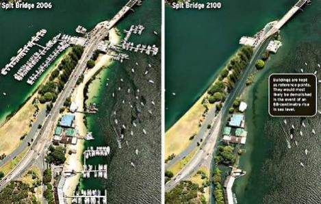
What happened to all the boats? Don't boats float on top of the water?
(thanks Tim Blair for this one)
billions of dollars worth of seaside properties up and down the coast are vulnerable to advancing shorelines and increased storm activity associated with climate change.
And the evidence:
Their modelling uses a range of sea level rises projected by the United Nations and the World Meteorological Organisation's International Panel on Climate Change of between nine and 88 centimetres by 2100.
But new scientific research has us increasing at 0.35mm a year or by the year 2100, just 3.2cm. Big difference.
But what is most funny, is the pictures that it produces with the first picture now, and the second picture what it will look like in the year 2100:

What happened to all the boats? Don't boats float on top of the water?
(thanks Tim Blair for this one)
Global Warming causes snowstorm!
Buffalo News reports that global warming is the reason behind a surprise massive snowstorm around someplace called Buffalo where all the local buffalo are now snap frozen like the wooly mammoth.
The newspaper reports that
As the climate changes and temperatures generally increase, we are more likely to see unpredictable, intense weather and, in Buffalo, more lake-effect snow.
God Holy Moses! So does this mean that the temperature is going to increase so much that the temperature will decrease? I don’t want to be snap frozen either! Someone save me from this intense freezing cold heat wave.
Tim the Tool Man
Tim Flannery, one of Australia’s leading scientists and also one of Australia's leading doomsday preacher comments on the impact of rising sea levels:
Picture an eight-storey building by a beach, then imagine waves lapping its roof. That’s what a 25-metre rise in sea level looks like.
Well lets once again look at the stats. Research has proven that in the last 7 years the sea levels have risen 2.5mm. SO that’s on average 0.35mm per year.
So how long will it take to reach 25 metres? Well a good 70,000 years. By then, I'm sure we'll all be living on mars. And a skyscraper on the beach? You honestly think they'll be such thing as a sky scraper in 70,000 years time?
 Picture of what we might look like in 70,000 years time.
Picture an eight-storey building by a beach, then imagine waves lapping its roof. That’s what a 25-metre rise in sea level looks like.
Well lets once again look at the stats. Research has proven that in the last 7 years the sea levels have risen 2.5mm. SO that’s on average 0.35mm per year.
So how long will it take to reach 25 metres? Well a good 70,000 years. By then, I'm sure we'll all be living on mars. And a skyscraper on the beach? You honestly think they'll be such thing as a sky scraper in 70,000 years time?
 Picture of what we might look like in 70,000 years time.
Sunday, October 29, 2006
The Big Finley Dry
John Howard has been traveling the countryside hearing heart wrenching dry stories from people most suffering from the current drought. He's being told that this isthe biggest drought in Australia’s history.
He went to visit irrigator Eric Dudley who live in Finley which is located in southern New South Wales, close to Wagga Wagga and even closer to the nearest Weather Station at Deniliquin. Dudley’s irrigation channels are completely dry, and it is reported that “dust blows incessantly across open plains.”
Dudly also says that they have never seen such bad conditions in a region known as Australia's food bowl and that he will reach financial ruin should conditions continue. It’s such a terrible story. And one that my heart doesn’t go out to.
But lets check the stats for Deniliquin, only around 50km form Dudley’s farm.
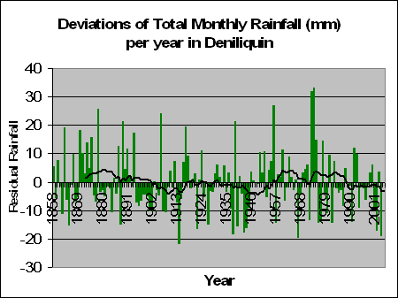
The graph on the left shows the rainfall for Deniliquin since 1858. It shows a pretty consistent graph with some big rainfall years and other less so, but either way, no significant increase or decrease.
More recently we had some bad years in 2001, 2002 and 2004 where Deniliquin averaged 9, 17 and 19 mm of rain less than the norm per month respectively. The breaker in the middle 2003, along with 1999 and 2000, had increased rainfall with on average 3.6 mm more than average per month. Considering that Deniliquin averages 33mm per month of rainfall, a drop of 10 to 20mm a month is considerable less, but as the graph suggests, definitely one that is not abnormal.
Similarly, there are plenty of great big spikes where Deniliquin has seen able rain. So it’s true, over the past couple of years we have seen decreased rainfall in this area. Is it the worst drought of all time here? Well no. Between 1895 and 1902 Deniliquin had 8 years of rainfall that was less than the average per month. Between 1940 and 1945 Deniliquin averaged 10mm less than the average per month. That’s over 70 months in a row with less than 10mm less rainfall than normal, which is surprisingly the same amount less than the current period from 2001.
Of course our heart goes out to Eric Dudley. He is experiencing less rainfall than normal at current. And If John Howard wants to hand out money to the dehydrated, then I’m all cool with that.
But one things for sure, that this recent dry weather in the south of New South Wales is well, quite normal. It’s not the worst drought in Australia’s history, and we are not even experiencing a trend of less and less rainfall per year – even in Deniliquin. Global warming has nothing to do with rainfall patterns. And either does level’s of Co2 in the air and human influence. Did I say one things for sure? I meant five things.
You’d have more chance at getting rain in Deniliquin by doing a rain dance rather than cutting down on those awful Co2 levels.
He went to visit irrigator Eric Dudley who live in Finley which is located in southern New South Wales, close to Wagga Wagga and even closer to the nearest Weather Station at Deniliquin. Dudley’s irrigation channels are completely dry, and it is reported that “dust blows incessantly across open plains.”
Dudly also says that they have never seen such bad conditions in a region known as Australia's food bowl and that he will reach financial ruin should conditions continue. It’s such a terrible story. And one that my heart doesn’t go out to.
But lets check the stats for Deniliquin, only around 50km form Dudley’s farm.

The graph on the left shows the rainfall for Deniliquin since 1858. It shows a pretty consistent graph with some big rainfall years and other less so, but either way, no significant increase or decrease.
More recently we had some bad years in 2001, 2002 and 2004 where Deniliquin averaged 9, 17 and 19 mm of rain less than the norm per month respectively. The breaker in the middle 2003, along with 1999 and 2000, had increased rainfall with on average 3.6 mm more than average per month. Considering that Deniliquin averages 33mm per month of rainfall, a drop of 10 to 20mm a month is considerable less, but as the graph suggests, definitely one that is not abnormal.
Similarly, there are plenty of great big spikes where Deniliquin has seen able rain. So it’s true, over the past couple of years we have seen decreased rainfall in this area. Is it the worst drought of all time here? Well no. Between 1895 and 1902 Deniliquin had 8 years of rainfall that was less than the average per month. Between 1940 and 1945 Deniliquin averaged 10mm less than the average per month. That’s over 70 months in a row with less than 10mm less rainfall than normal, which is surprisingly the same amount less than the current period from 2001.
Of course our heart goes out to Eric Dudley. He is experiencing less rainfall than normal at current. And If John Howard wants to hand out money to the dehydrated, then I’m all cool with that.
But one things for sure, that this recent dry weather in the south of New South Wales is well, quite normal. It’s not the worst drought in Australia’s history, and we are not even experiencing a trend of less and less rainfall per year – even in Deniliquin. Global warming has nothing to do with rainfall patterns. And either does level’s of Co2 in the air and human influence. Did I say one things for sure? I meant five things.
You’d have more chance at getting rain in Deniliquin by doing a rain dance rather than cutting down on those awful Co2 levels.
Friday, October 27, 2006
Is it the worst drought on record?
Drought, the buzz word at the moment is hitting Australian farmers hard. In Queensland, the government are meeting to give assistance to the farmers. Telstra are giving farmers more time to pay their bills, and the ABARE says that the current drought will cost Australia over $6.2 billion.
John Howard has been listening to heart wrenching dry stories , even golf courses are effected and if it’s not the hot dry that’s ruining crops, it’s the freezing cold as well:
Thanks to Andrew Bolt who writes that Deputy Premier of Victoria John Thwaites says that
So all the evidence points to a significant involvement of global warming in the present drought.
Professor Peter Cullen, a National Water Commission member and top government adviser, who gloated that, thanks to the drought,
flat earth skeptics who have been in denial about climate change are now realising that wishing it away didn’t work
So what is a drought exactly? According to the dictionary it’s a period of dry weather, e.g. no rain. Given that, it makes perfect sense that this terrible time of lack of rain we are experiencing now would show up in the data. I mean, after all, that’s why we all say there’s a drought right? – not just from some people’s opinion on it all.
Let’s check out the stats.

According to the ABM, the graph on the left shows Australia’s rainfall patterns since 1900. If anything the longer trend tends to suggest an increase in rainfall over this period. However the result when testing is not significant (F = 1.25, p = 0.266). Hence we can conclude that Australia’s rainfall has not significantly increased or decreased over time.

But we are talking about global warming aren’t we? Well here’s the graph which talks about global rainfall on the left. Hmm, no real pattern there either. If anything, it's cyclic.
Could it be, that with the last 4 years having less rainfall than previously (but still remember not significantly less), that individuals are complaining of lack of water because it didn’t quite get to the levels of the 5 years before that? Or is this trend simply natural? Like when animals hide food for when times are tough, were these farmers spending their water expecting the same big waters of the 5-10 year ago stage, and still spending their water in the same way, expecting the downpours, not getting them, and them claiming drought and handouts from the government?
If the rain patterns show no long term reduction, then where’s the drought? Where?
More on this, with more detail soon.
John Howard has been listening to heart wrenching dry stories , even golf courses are effected and if it’s not the hot dry that’s ruining crops, it’s the freezing cold as well:
Thanks to Andrew Bolt who writes that Deputy Premier of Victoria John Thwaites says that
So all the evidence points to a significant involvement of global warming in the present drought.
Professor Peter Cullen, a National Water Commission member and top government adviser, who gloated that, thanks to the drought,
flat earth skeptics who have been in denial about climate change are now realising that wishing it away didn’t work
So what is a drought exactly? According to the dictionary it’s a period of dry weather, e.g. no rain. Given that, it makes perfect sense that this terrible time of lack of rain we are experiencing now would show up in the data. I mean, after all, that’s why we all say there’s a drought right? – not just from some people’s opinion on it all.
Let’s check out the stats.

According to the ABM, the graph on the left shows Australia’s rainfall patterns since 1900. If anything the longer trend tends to suggest an increase in rainfall over this period. However the result when testing is not significant (F = 1.25, p = 0.266). Hence we can conclude that Australia’s rainfall has not significantly increased or decreased over time.

But we are talking about global warming aren’t we? Well here’s the graph which talks about global rainfall on the left. Hmm, no real pattern there either. If anything, it's cyclic.
Could it be, that with the last 4 years having less rainfall than previously (but still remember not significantly less), that individuals are complaining of lack of water because it didn’t quite get to the levels of the 5 years before that? Or is this trend simply natural? Like when animals hide food for when times are tough, were these farmers spending their water expecting the same big waters of the 5-10 year ago stage, and still spending their water in the same way, expecting the downpours, not getting them, and them claiming drought and handouts from the government?
If the rain patterns show no long term reduction, then where’s the drought? Where?
More on this, with more detail soon.
Thursday, October 26, 2006
False Optimism
MSNBC reported in May:
The 2006 Atlantic hurricane season will be very active with up to 10 hurricanes, although not as busy as record-breaking 2005, when Hurricane Katrina and several other monster storms slammed into the United States, the U.S. government’s top climate agency said on Monday.
“NOAA is predicting 13 to 16 named storms, with eight to 10 becoming hurricanes, of which four to six could become ‘major’ hurricanes of Category 3 strength or higher,” said Conrad Lautenbacher, administrator of the National Oceanic and Atmospheric Administration.
But unfortunately for him this never happened:
Instead, it has been a long, lazy hurricane season with just half the number of hurricanes predicted and not a single one making landfall.
"Weather forecasting is a chancy business,” said Hugh Willoughby, a professor of hurricane science at Florida International University. “It’s gotten a lot better, but if you can’t stand being wrong, you shouldn’t be in the business."
Thanks to Tim Blair who reports that
Can’t predict tomorrow’s weather, can’t predict next year’s weather ... yet there’s a scientific consensus about weather in the coming century and beyond. Just as well these folks are adapting to being wrong.
And what about Australian Hurricanes/Cyclones?

This graph on the left as given out by the ABM shows the number and intensity of cyclones from the year 1970 to 1998. They report
that the total number of cyclones has decreased in recent decades. However, the number of stronger cyclones (minimum central pressure less than 970 hPa) appears to have increased slightly.
Interesting. I don’t come to the same conclusion. My statistical analysis of the data given on that graph actually come to the conclusion of a statistically significant decrease in the number of cyclones over the period from 1970 to 1998. (F = 4.99, p = 0.034). For those not in the statistical know-how. Generally scientists prove a significant result if the p value is below 0.05 (5%). This means that there is a 3.4% chance that the decrease in cyclones in this period is due to luck or random variation.
My analysis of stronger cyclones proves no significant increase or decrease over this time period (F = 1.17, p = 0.289). Hence we can conclude, contrary to what was written by the ABM that there is no evidence to prove that strong cyclones have increased or decreased in the past 30 years, and strong evidence that the total number of cycles has significantly decreased.
I guess people see different things in graphs when they want to believe. Lucky we can test this to prove it instead.
The 2006 Atlantic hurricane season will be very active with up to 10 hurricanes, although not as busy as record-breaking 2005, when Hurricane Katrina and several other monster storms slammed into the United States, the U.S. government’s top climate agency said on Monday.
“NOAA is predicting 13 to 16 named storms, with eight to 10 becoming hurricanes, of which four to six could become ‘major’ hurricanes of Category 3 strength or higher,” said Conrad Lautenbacher, administrator of the National Oceanic and Atmospheric Administration.
But unfortunately for him this never happened:
Instead, it has been a long, lazy hurricane season with just half the number of hurricanes predicted and not a single one making landfall.
"Weather forecasting is a chancy business,” said Hugh Willoughby, a professor of hurricane science at Florida International University. “It’s gotten a lot better, but if you can’t stand being wrong, you shouldn’t be in the business."
Thanks to Tim Blair who reports that
Can’t predict tomorrow’s weather, can’t predict next year’s weather ... yet there’s a scientific consensus about weather in the coming century and beyond. Just as well these folks are adapting to being wrong.
And what about Australian Hurricanes/Cyclones?

This graph on the left as given out by the ABM shows the number and intensity of cyclones from the year 1970 to 1998. They report
that the total number of cyclones has decreased in recent decades. However, the number of stronger cyclones (minimum central pressure less than 970 hPa) appears to have increased slightly.
Interesting. I don’t come to the same conclusion. My statistical analysis of the data given on that graph actually come to the conclusion of a statistically significant decrease in the number of cyclones over the period from 1970 to 1998. (F = 4.99, p = 0.034). For those not in the statistical know-how. Generally scientists prove a significant result if the p value is below 0.05 (5%). This means that there is a 3.4% chance that the decrease in cyclones in this period is due to luck or random variation.
My analysis of stronger cyclones proves no significant increase or decrease over this time period (F = 1.17, p = 0.289). Hence we can conclude, contrary to what was written by the ABM that there is no evidence to prove that strong cyclones have increased or decreased in the past 30 years, and strong evidence that the total number of cycles has significantly decreased.
I guess people see different things in graphs when they want to believe. Lucky we can test this to prove it instead.
Australian Temperatures
There has been a lot of hype regarding climate change and global warming. Millions of dollars have been pored into analysis and what we can do to make the world a greener planet. I am all for making the planet better, but the question has to be asked, how much should we spend (that we would otherwise be spending elsewhere) to do so, and will it make any difference at all, and if so, are there any benefits or not?
Of course, I can't answer all these questions myself. My area of expertise is statistics, and I plan on analysing weather data, mainly from Australia, in order to determine the magnitude of the well advertised recent temperature increase, and prove whether or not this increase is actually statistically significant or not. If it is, there could well be a case for global warming. Whether or not this is human or naturally induced is another question. If not, then we should seriously consider our perspective on the phenomenon.

We’ve all seen the graphs of increases of temperature, with a sharp increase in the last 20 years. The Australian Bureau of Meteorology is Australia’s own government run weather company. This graph given on the left is from them and it shows the temperature from 1910 until 1999. It shows a reasonably constant temperature of 0.25 degrees C below the average of 1961 to 1980 between the years 1910 to about 1960. After 1960 we have about a 0.25 degree increase for 20 years to be on level with the 1961 to 1980 period (kinda makes sense doesn’t it, that the average temperature from 1960 to 1980 is about the same as the average temperature from 1961 to 1990). Following 1980 we have another increase of about 0.25 degrees and this remains pretty constant for the next 20 years. Hence since 1991 we have had an average increase of 0.5 degrees.

This is highlighted more clearly by some more graphs done by the bureau in moe recent times up until 2003. On the left if the Annual Mean Temperature Anomalies for Australia from 1910 to 2003. The difference is definitely significant. Prior to 1970 there were only 7 times when the average mean temperature was above the 1961 to 1990 average.

The annual maximum temperature anomalies for Australia given on the left show a similar pattern, not quite to the same extremes, but an obvious increase in temperature. When looking at the annual minimum temperature as given below the difference is intensified. It seems that Australia is heating up more at night that during the day, although both have significant increases in the last 20 years. With regards to the annual minimum temperature anomaly from the period to 1916 to 1958, not one year recorded a minimum temperature higher than that of the average of 1961 to 1990.

We shall be discussing these graphs, as well as the start of our own analysis in a lot of detail. Stay tuned peoples!
Of course, I can't answer all these questions myself. My area of expertise is statistics, and I plan on analysing weather data, mainly from Australia, in order to determine the magnitude of the well advertised recent temperature increase, and prove whether or not this increase is actually statistically significant or not. If it is, there could well be a case for global warming. Whether or not this is human or naturally induced is another question. If not, then we should seriously consider our perspective on the phenomenon.

We’ve all seen the graphs of increases of temperature, with a sharp increase in the last 20 years. The Australian Bureau of Meteorology is Australia’s own government run weather company. This graph given on the left is from them and it shows the temperature from 1910 until 1999. It shows a reasonably constant temperature of 0.25 degrees C below the average of 1961 to 1980 between the years 1910 to about 1960. After 1960 we have about a 0.25 degree increase for 20 years to be on level with the 1961 to 1980 period (kinda makes sense doesn’t it, that the average temperature from 1960 to 1980 is about the same as the average temperature from 1961 to 1990). Following 1980 we have another increase of about 0.25 degrees and this remains pretty constant for the next 20 years. Hence since 1991 we have had an average increase of 0.5 degrees.

This is highlighted more clearly by some more graphs done by the bureau in moe recent times up until 2003. On the left if the Annual Mean Temperature Anomalies for Australia from 1910 to 2003. The difference is definitely significant. Prior to 1970 there were only 7 times when the average mean temperature was above the 1961 to 1990 average.

The annual maximum temperature anomalies for Australia given on the left show a similar pattern, not quite to the same extremes, but an obvious increase in temperature. When looking at the annual minimum temperature as given below the difference is intensified. It seems that Australia is heating up more at night that during the day, although both have significant increases in the last 20 years. With regards to the annual minimum temperature anomaly from the period to 1916 to 1958, not one year recorded a minimum temperature higher than that of the average of 1961 to 1990.

We shall be discussing these graphs, as well as the start of our own analysis in a lot of detail. Stay tuned peoples!
Subscribe to:
Comments (Atom)
