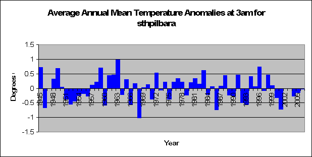
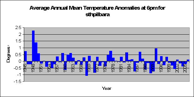
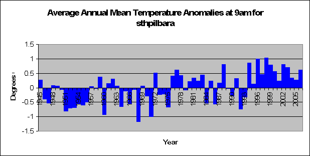
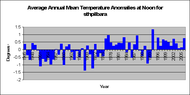
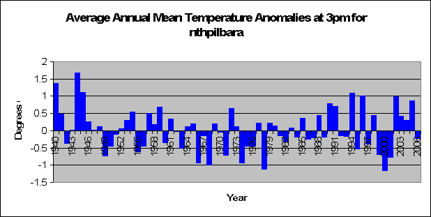
I promised you some good analysis on Southern Pilbara (central-west Western Australia) yesterday when I analysed the temperatures and I keep to my promise so here it is:
Yesterday we came up with the very unusual result that despite the fact that there was no significant increases in temperature from 9pm to 6am in southern Pilbara - and not even any recogniseable patterns – we found that the area recorded a significant increase in minimum temperature. This is very surprising. We also found that in the area temperatures were significantly higher from 9am thru to 3pm when the sun is at it’s hottest.
At first look it’s quite clear that the reason southern Pilbara is heating up is solely due to the sun. The sun is just getting damned hotter. So why the increase in minimum temperatures, especially when there is no difference in temperatures throughout the night?
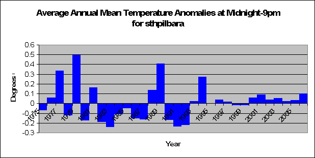
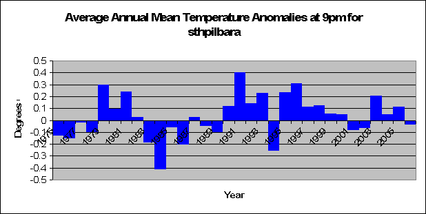
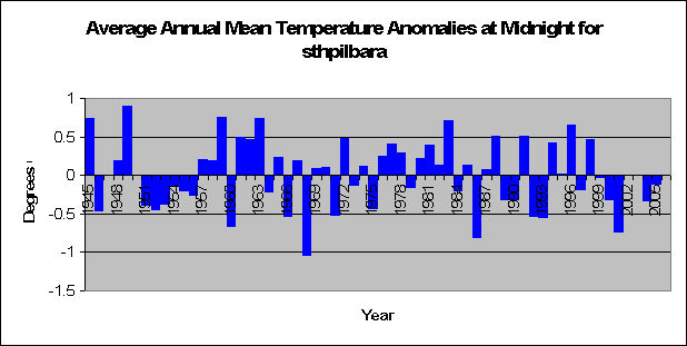
I decided to have a look at the differences in temperature anomalies for neighboring times over the years. In other words, I looked at the temperature anomalies for Midnight minus 9pm. As previously noted, 9pm doesn’t have a lot of data for Southern Pilbara so it is hard to find a pattern, and the statistics suggest no difference (t = 0.24, p = 0.81). In other words, Midnight has not been heating up at a quicker rate than 9pm over the years in Southern Pilbara.
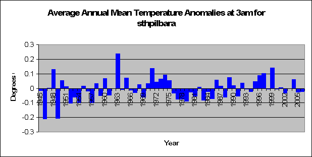
The same goes for 3am minus Midnight, only this time we have a good amount of data. There is no pattern. Temperatuers at 3am have not been heating up quicker or slower than Midnight over the years (t = 1.4, p = 0.15).
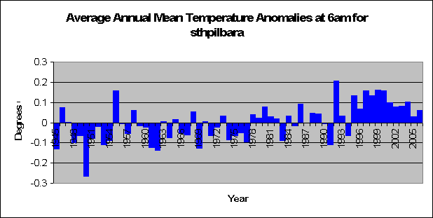
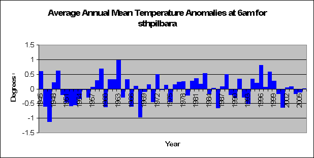
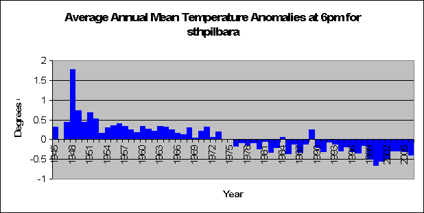
But wow, look at this. When looking at 6am minus 3am, we find that temperatures have increased at a significantly higher rate at 6am than 3am (t = 5.3, p < 0.01). Keeping in mind that we did not find a significant increase in temperature at 6am, however we have found that the temperature increase at 6am is significantly greater than 3am. This has occurred with especial magnitude in the last 10 years as shown in the graph.
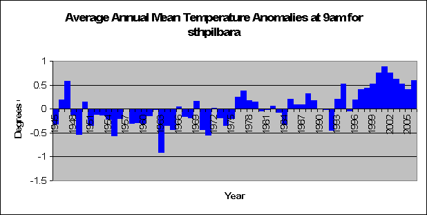
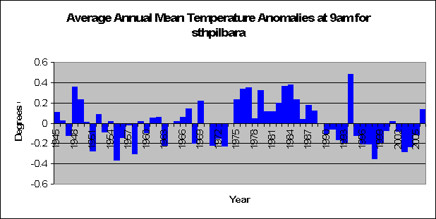
And a similar pattern occurs when looking at the 9am – 6am anomalies. A significant increase occurs (t = 6.04, p < 0.01). With temperatures increasing on average 0.5 degrees more in the past 10 years. If you look at the 6am and 9am graphs, this makes sence, as in the last 10 years 6am was about average temperature whilst 9am temperatures were about 0.5 degrees above the norm.
Surprisingly this is where the large boom stops. Analysis of Noon minus 9am temperatures suggest no increase or decrease in temperature (t = -0.6, p =0.55). A cyclic pattern can be seen, but this could be purely due to random variation.
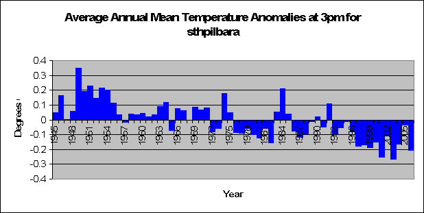
And now for the even more surprising results. 3pm minus Noon saw a significant decrease in anomaly temperatures (t = -8.1, p < 0.01). The decrease is almost perfectly linear and is clearly obvious. So despite significant increase in temperature for south Pilbara for Noon and 3pm, 3pm isn’t heating up as much as it has been 3 hours before.
The obvious linear line in the graph of 6pm to 3pm is startling. So perfect is the line, that the amount of variability is very small. The decreasing trend is very significant (t = -10.8, p < 0.01).
There was no significant difference in temperatures when looking at the differences between the 9pm and 6pm anomalies, however a smaller database for temperatures at 9pm could have been a factor (t = 1.3, p = 0.18).
So what does all this mean? How is this all relevant. Well let’s summarise what we have just found. The rate of increase or decrease in temperatures with respect to the time 3 years prior makes little difference at night, but when the sun is a factor the difference is significant. Temperature anomalies at 6am and 9am have increased significantly with respect to the time 3 hours previous over the years, whilst temperatures at 3pm and 6pm have decreased significantly with respect to the time 3 hours previous.
But to understand fully what this means, we have to discuss very briefly how daily temperature works. Basically we reach a maximum temperature, and from that point on the temperature generally decreases. When the sun as set, there is no general reason why temperatures will be on the rise, so they decrease until the sun makes an appearance again. In southern Pilbara the sun rises in general half way between 6am and 9am depending on the season.
We suggested before that is was relatively obvious that the sun was a major factor in determining the average maximum temperature in Southern Pilbara, as we saw no increases in temperature over night. We have also proven that the sun has made significant increases in maximum temperature rather than minimum during years when Australia is heating up. So would a stronger sun therefore also have an influence on minimum temperatures? Our analysis suggests so.
Whilst no increases in temperature were found for Southern Pilbara from between 9pm and 6am when the sun was set, at 6am, the temperature increase as compared to 3am was highly significant. The sun, whilst not risen, quite possibly was warming up neighbouring areas more than normal, and adding heat to the air above at a greater rate than normal. Thus paving the way for when it makes its grand entrance at sunrise.
Hence, whilst not making a significant temperature difference at 6am before sunrise, it made a significant increase in temperature compared to 3 hours prior at a time where normally the minimum temperature would have been reached. This extra layer of heat paved the way for massive increases in temperature at 9am after the sun had risen. Following, due to the massive increases in temperature 9am, Noon and 3pm also had increasing temperatures due to the intensity of the sun, but not quite as dramatic as that when the sun rose. Hence we have a situation where we have a significant increase in temperature at 3pm but a highly significant decrease in temperature at 3pm with relation to Noon. I guess there’s only so much difference that the sun can make.
So what can we conclude about Southern Pilbara? That increases in the suns intensity has caused the area to heat up during the day, to stay at a constant temperature during the night, and most importantly, that increased intensity in the sun has not only caused increases in maximum temperatures but also increases in minimum temperatures.
Who would have thought that the sun has something to do with heat?
Friday, February 23, 2007
Thursday, February 22, 2007
The Globe will be cooler
First it was naughty screensavers that were bad, and now it is the ordinary light globe. Australia is planning on banning the light globe in favour of the energy saving counterpart. Of course we shouldn't worry about some of the problems that the energy saving light globe can cause like these:
Here are some known issues with Compact Fluorescent Bulbs.
Instead, lets look at the benefits that getting rid of the energy wasting globe will save. As noted by MSNBC
Legislation to gradually restrict the sale of the old-style bulbs could reduce Australia's greenhouse gas emissions by 4 million tons by 2012.
Note the word could. So best case scenario, we'll save 4 million tons of greenhouse gas by 2012. Lets assume that 100% of recent warming is caused by the deadly gas, and given that Australia's greenhouse gas output is 1.6% of the worlds, and that we have seen an increase in 0.6 degrees in the last century this will mean that banning these light globes will make the world on average
0.0000012 degrees cooler per year.
Keeping in mind that this is a best case scenario. I can almost feel a chill in the air right now.
Only the sun heats up Southern Pilbara
Ok guys you are going to love this, whilst not giving all the analysis away today, the rest will follow most likely Friday, but let me introduce the area first.
The area is southern Pilbara. Obviously south of North Pilbara on the west coast of Australia. A delightful place. Some great national parks, and not a lot in between. Anyway, There are three main weather stations in the area with significant data, these being Carnavon airport, Meekatharra airport and Geraldton airport.
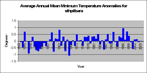
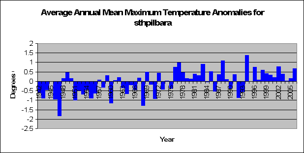
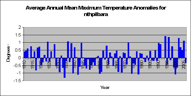
Analysis of maximum and minimum temperatures shoes a very significant increase in maximum temperatures (t = 4.87, p < 0.05) and a significant increase in minimum temperatures (t = 2.3, p = 0.023). So it seems at first that this place is just hotting up all year round. Data for this area is pretty good, all temperature data (max, min, and specific times) go back to the mid 1940’s with the exception of 9pm which starts in 1975.
When we look at certain times we see a few interesting things. Temperatures at Midnight, 3am, 6am, 6pm and 9pm show no significant increase in temperature. (Midnight: t = -0.67, p = 0.5; 3am: t = -0.42, p = 0.67, 6am: t = 1.03, p = 0.30; 6pm: t = -1.94, p = 0.54; 9pm: t = -1.01, p = 0.31). In fact temperatures at 6pm almost show a significant decrease.
When we look at 9am, Noon and 3pm we see highly significant increases in temperature. (9am: t = 4.9, p < 0.01; Noon: t = 3.9, p < 0.01; 3pm: t = 2.7, p < 0.01). So in other words we are seeing that when the sun is in the air in full glory Southern Pilbara is heating up more so now that it has in the past. However, when the sun is on the other side of the globe and the stars are twinkling, there is no difference in temperature.
Seems like the sun has a lot to do with recent warming in southern pilbarara doesnt it? Well that would be the case, however we funnily observe a significant increase in minimum temperatures as well. This is very strange, as from between 6pm and 6am there was nothing to suggest that temperatures are increasing. So why has this strange phenomenon occurred? We’ll look real deep at the data tomorrow for some ground breaking research and amazing results.
The area is southern Pilbara. Obviously south of North Pilbara on the west coast of Australia. A delightful place. Some great national parks, and not a lot in between. Anyway, There are three main weather stations in the area with significant data, these being Carnavon airport, Meekatharra airport and Geraldton airport.
Analysis of maximum and minimum temperatures shoes a very significant increase in maximum temperatures (t = 4.87, p < 0.05) and a significant increase in minimum temperatures (t = 2.3, p = 0.023). So it seems at first that this place is just hotting up all year round. Data for this area is pretty good, all temperature data (max, min, and specific times) go back to the mid 1940’s with the exception of 9pm which starts in 1975.
When we look at certain times we see a few interesting things. Temperatures at Midnight, 3am, 6am, 6pm and 9pm show no significant increase in temperature. (Midnight: t = -0.67, p = 0.5; 3am: t = -0.42, p = 0.67, 6am: t = 1.03, p = 0.30; 6pm: t = -1.94, p = 0.54; 9pm: t = -1.01, p = 0.31). In fact temperatures at 6pm almost show a significant decrease.
When we look at 9am, Noon and 3pm we see highly significant increases in temperature. (9am: t = 4.9, p < 0.01; Noon: t = 3.9, p < 0.01; 3pm: t = 2.7, p < 0.01). So in other words we are seeing that when the sun is in the air in full glory Southern Pilbara is heating up more so now that it has in the past. However, when the sun is on the other side of the globe and the stars are twinkling, there is no difference in temperature.
Seems like the sun has a lot to do with recent warming in southern pilbarara doesnt it? Well that would be the case, however we funnily observe a significant increase in minimum temperatures as well. This is very strange, as from between 6pm and 6am there was nothing to suggest that temperatures are increasing. So why has this strange phenomenon occurred? We’ll look real deep at the data tomorrow for some ground breaking research and amazing results.
Wednesday, February 21, 2007
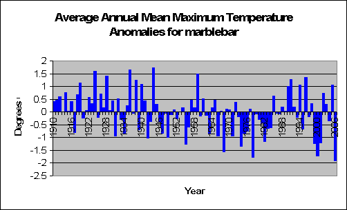
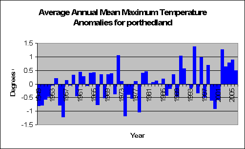
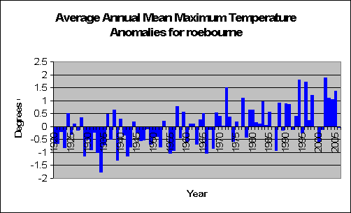
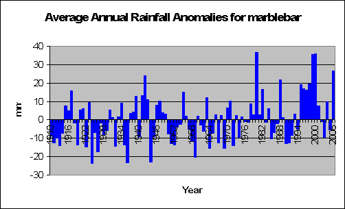
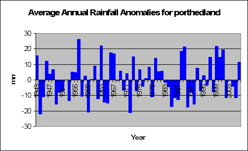
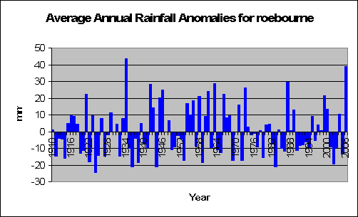
Not so hot Marble Bar
The Pilbara is a section of mid western western Australia, and to start off with we’ll look at the northern section of it. It’s very dry there. I once went to marble bar, and there’s not a lot going on. In fact, the only thing to do there was drink beer, which is what everyone naturally does. It’s very hot, all year around, and the amount of rain is very very low. So any increase would be a natural godsend. But lets look at the temperature first.
Monday, February 19, 2007
Polar Bear bites reporter: proof of global warming
60 Minutes has never heard of bears getting stroppy with intruders. So when one polar bear - normally a cute little zoo animal - bites a reporter they conclude the reason.....of course...global warming. As they report:
"If you still have any lingering doubts about global warming, stick around. We’re off to the Arctic, where Tara Brown found all the proof she needed that there’s something drastically wrong with the world’s weather. It came in the shape of a very large, very hungry polar bear - an angry predator, with us as its prey. Stranded in the middle of nowhere with a three-metre, 300kg bear on the attack is a frightening experience. It’s also a graphic lesson in what happens when we mess with nature. As global temperatures rise, the ice cap melts and the polar bears’ hunting grounds disappear. Now they’re starving, desperate for food - so desperate even humans look appetising."
Case closed. However the Wall street journal thinks otherwise:
But hey, I can understand 60 minutes on one side. My next door neighbours car hissed at me the other day, so naturally I thought cats were almost extinct too. Thanks to Andrew Bolt.Apparently so, because there are in fact more polar bears in the world now than there were 40 years ago, as the nearby chart shows. The main threat to polar bears in recent decades has been from hunting, with estimates as low as 5,000 to 10,000 bears in the 1950s and 1960s. But thanks to conservation efforts, and some cross-border cooperation among the U.S., Canada and Russia, the best estimate today is that the polar bear population is 20,000 to 25,000.
It also turns out that most of the alarm over the polar bear’s future stems from a single, peer-reviewed study, which found that the bear population had declined by some 250, or 25%, in Western Hudson Bay in the last decade. But the polar bear’s range is far more extensive than Hudson Bay. A 2002 U.S. Geological Survey of wildlife in the Arctic Refuge Coastal Plain concluded that the ice bear populations “may now be near historic highs.” One of the leading experts on the polar bear, Mitchell Taylor, the manager of wildlife resources for the Nunavut territory in Canada, has found that the Canadian polar bear population has actually increased by 25%—to 15,000 from 12,000 over the past decade.
Mr. Taylor tells us that in many parts of Canada, “polar bears are very abundant and productive. In some areas, they are overly abundant. I understand that people not living in the North generally have difficulty grasping the concept of too many polar bears, but those who live here have a pretty good grasp of what that is like.” Those cuddly white bears are the Earth’s largest land carnivores.
Friday, February 16, 2007
Naughty Screen Savers
News just in! ANZ have just announced that they are banning screen savers from their computers to save on green house gases. Those bad naughty screen savers of flying windows and personalised photographs have to go in order to save the planet. Feb 23rd is the date when they all go, and no doubt from that day forward we will see more rainfall and colder weather.
What a difference it will make!
What a difference it will make!
Global Warming makes you rich
Time Flannery, Australian of the year and scaremonger of the year has revealed that he is charging at least US$50k per speech that he delivers.
Hmm, maybe I'm in the wrong profession. If I was campaigning for global warming, I'd probably be rich.
Hmm, maybe I'm in the wrong profession. If I was campaigning for global warming, I'd probably be rich.
Yep, Antarctica is still damn cold
A new report incdicates that Antarctica is not warming up as climate models suggest it should. David Bromwich, professor of geography and researcher with the Byrd Polar Research Center at Ohio State University said:
“It’s hard to see a global warming signal from the mainland of Antarctica right now.”
“The best we can say right now is that the climate models are somewhat inconsistent with the evidence that we have for the last 50 years from continental Antarctica. We’re looking for a small signal that represents the impact of human activity and it is hard to find it at the moment”
This comes as no surprise to readers of Gust of Hot Air. My analysis at Macquarie Island as well as at Mawson suggest that there is no increase or decrease in temperatures in the last 50 years.
So nothing new here...
Thursday, February 15, 2007
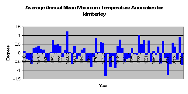
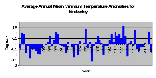
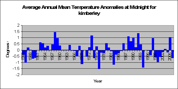
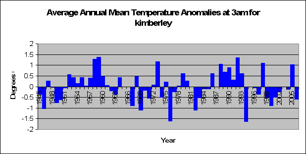
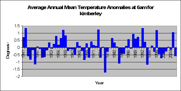
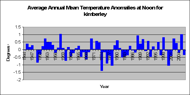
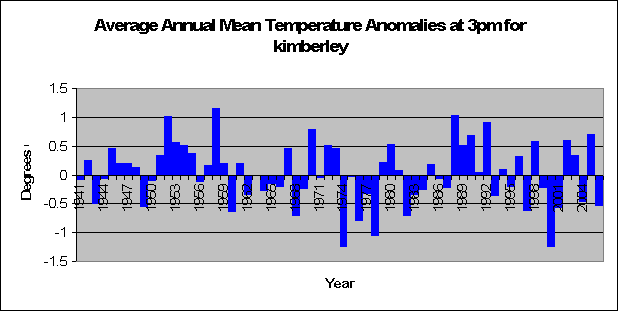
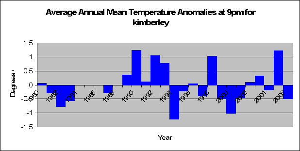
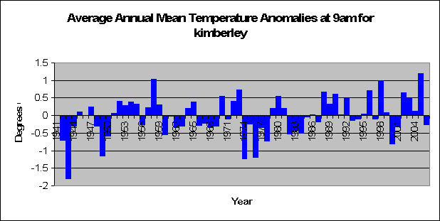
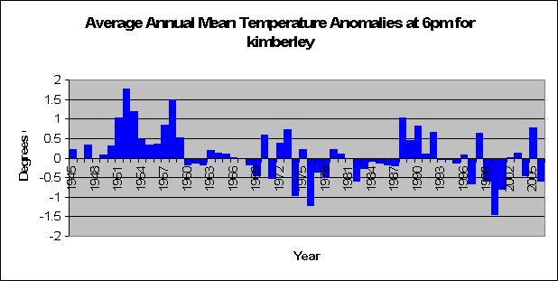
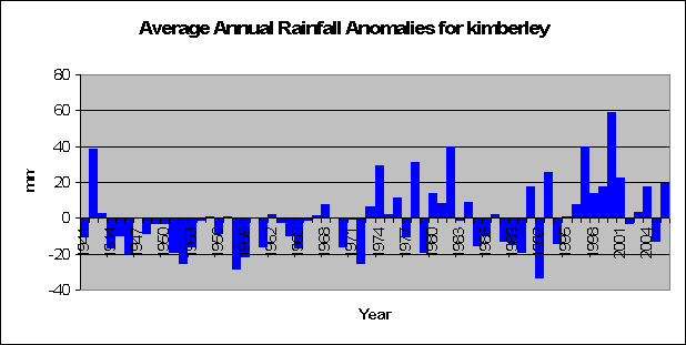
Kimberley: hot on the rise, cold on the set
Well after my hard disk on my computer over-heated due to global warming (well not really), I’ve managed to get the data again and re-write the programs that spit out all the fancy nice graphs. And it’s onto the next great section of

Wednesday, February 14, 2007
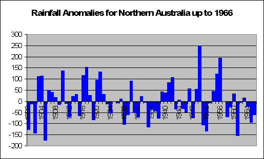
Global Warming Trends in 1966
Lets time warp ourselves back to 1966. Australian Politician Robert Menzies resigns, the Soviet Luna 9 spacecraft makes the first controlled rocket-assisted landing on the moon, Australia
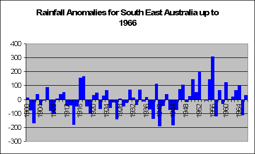
The graph below shows what is happening in northern
Tuesday, February 13, 2007
Bias in the IPCC?
The IPCC (Intergovernmental Panel on Climate Change) which was established to evaluate the risk of climate change bought on by humans, has declared a 90% probability that climate change has been bought on by humans (smart decision, otherwise I guess they would all be out of a job).
So their conclusions are hardly surprising, I would expect nothing else. Would a teachers union declare that teachers were not necessary for teaching students?
If there was the opposite of the IPCC, for example the IPNHCC (the international panel on non human induced climate change), and they reported that they are 90% positive that humans are not the cause of climate change, should we believe them or the IPCC?
Of course there isn't an IPNHCC, but there is plenty of peer reviewed scientific research that concludes that greenhouse gases is a very very small factor in climate change, and that other factors, like changes in the sun, are far more influential. I guess it all comes down to picking and choosing the research that suits your cause best.
In jan 2005, Christoper Landsea withdrew from the IPCC's 4th report claiming that the IPCC had become politicized and the leadership ignored his concerns. Landsea does not believe that global warming has a strong influence on hurricanes: "global warming might be enhancing hurricane winds, but only by 1 percent or 2 percent". He strongly questions the accuracy of the historical global hurricane database for comparisons with current observations, citing an uncounted, catastrophic 1970 storm as an example.
Of course Landsea does believe that greenhouse gases are a cause of global warming, but what percentage this is is debatable amongst the scientists.
Global warming gets reality Czech
As reported by Luboš Motl,
Vaclav Klaus, president of the Czech Republic, explains a few things about global warming, economics and the sanity of Al Gore:
Vaclav Klaus, president of the Czech Republic, explains a few things about global warming, economics and the sanity of Al Gore:
Global warming is a myth and every serious person and scientist says so. It is not fair to refer to the U.N. panel. IPCC is not a scientific institution: it’s a political body, a sort of non-government organization of green flavor. It’s neither a forum of neutral scientists nor a balanced group of scientists. These people are politicized scientists who arrive there with a one-sided opinion and a one-sided assignment. Also, it’s an undignified slapstick that people don’t wait for the full report in May 2007 but instead respond, in such a serious way, to the summary for policymakers where all the “but’s” are scratched, removed, and replaced by oversimplified theses.
This is clearly such an incredible failure of so many people, from journalists to politicians…
Q: How do you explain that there is no other comparably senior statesman in Europe who would advocate this viewpoint? No one else has such strong opinions…
A: My opinions about this issue simply are strong. Other top-level politicians do not express their global warming doubts because a whip of political correctness strangles their voice…
Q: Don’t you believe that we’re ruining our planet?
A: I will pretend that I haven’t heard you. Perhaps only Mr Al Gore may be saying something along these lines: a sane person can’t…I don’t see any ruining of the planet, I have never seen it, and I don’t think that a reasonable and serious person could say such a thing… For example, we know that there exists a huge correlation between the care we give to the environment on one side and the wealth and technological prowess on the other side. It’s clear that the poorer the society is, the more brutally it behaves with respect to Nature, and vice versa.
It’s also true that there exist social systems that are damaging Nature - by eliminating private ownership and similar things - much more than the freer societies. These tendencies become important in the long run. They unambiguously imply that today, on February 8th, 2007, Nature is protected uncomparably more than on February 8th ten years ago or fifty years ago or one hundred years ago.
That’s why I ask: how can you pronounce the sentence you said? Perhaps if you’re unconscious?
Global Warming Video
Ok it's really old, but it's semi-interesting viewing...kinda
http://www.youtube.com/watch?v=XUlGoaAOzqA
http://www.youtube.com/watch?v=XUlGoaAOzqA
Monday, February 12, 2007
IPCC analysis proves statistical insignificance
The IPCC recently have said that there is a 90% probability that global warming is caused by man. How they ever got that number, I don't have the faintest.
So I guess based on a 95% statistical test, we have to therefore accept the null hypothesis and conclude that the probability that global warming is man made is not statistically significant (p > 0.05).
Hence, thanks to the IPCC's report, we shouldn't worry about reducing CO2 levels because their own analysis is insignificant.
Phew, what a relief!
Australia's climate is changing: it always has
Tim Flannery has done it again. Recently given the status of Australian of the year for his scare mongering climate doomsday talk, he wrote this piece for the Age.
He suggests that current rainfall trends in Australia support the idea that farmers in the drought stricken south should move further north where the rain is plentiful.
“On the face of it, current rainfall trends would support this idea because southern Australia is receiving ever less rain, while larger and larger amounts are falling over the north, particularly the north-west.”
“During the past 50 years, the shift in rainfall has been substantial, with some areas of southern and eastern Australia receiving 250 millimeters less rainfall than they did back then, while parts of the north-west are receiving 250 millimeters more.”
He continues on saying:
“But before making large investments in the transfer of agriculture north, we would be wise to ask what is causing these changes in rainfall, and to try to determine whether the trends will continue.”
Obviously a great idea. Neville Nicholls as commissioned by the Australian Greenhouse office conducted a study and concluded that
“there is strong scientific evidence that rising temperatures are being caused by an increase in greenhouse gas concentrations.”
So a study funded by the greenhouse office concluded that greenhouse gases were the cause. Amazing!
But in the same paragraph suggests that
“These gases are also thought to be causing at least part of the rainfall decline across southern Australia, though land clearance and natural variability of rainfall may also be having an impact”
So in other words, we have no hard proof of why the rainfall has changed, if of course it has. It could be a number of different things. But let’s jump to conclusions as Flannery does and suggest that
“it is our human pollution — from sources as diverse as power plants, motor vehicles, and farms — that is contributing to the drying of our country and causing immense hardship”
Astonishingly, Flannery goes on to say that
“Astonishingly, given the huge impact that the loss of rainfall in the east is having on Australia, there have been no detailed Australian studies of the cause of this rainfall loss.”
What? So we have no significant research done in this area. But didn’t Flannery just conclude that power plants, cars and other evils are the cause? All based on “no detailed Australian studies”? Talk about jumping to conclusions.
Ok, so let’s do a simple analysis of the weather then. Once again as shown on the graph below, rainfall has been low in south eastern Australia the last 5 years, but not as low as it has been in the past. Last year south eastern Australia didn’t have a lot of rain, but in 1982 we had a lot less. And despite the last 5 years having limited drizzle, the period of 1940 to 1944 had less rain than what we are experiencing now. To me, that just means natural variability, and our statistical analysis proves it so (t = 1.29 p = 0.20).

But what of southern Australia? The graph below shows rainfall for all of southern Australia since 1900. Last year we didn’t have a lot of rain, but we still had 70 more millimeters than we did in 1940 and 64 more millimeters than we did in 1944. Looks like a case again for natural variability, although if you look hard enough you can see a slight increase in rainfall over the years. What does our statistical analysis say? Yes! Amazing. Our analysis suggests a statistically significant increase in rainfall in southern Australia (t = 2.06, p = 0.04) at the rate of an extra 0.44 millimeters per year.

So the south is getting more rain, despite not so in the last 5 years. Excellent news indeed.
Now let’s head to the north, and we can see from the graph below we get a lot more variation in the year to year differences. We had a whole stack of rain from 1997 to 2001 as well as from 1973 to 1976. There looks to be an increase in rainfall from about this period onwards, but let’s let the statistical analysis do the talking. And yes, we find a significant increase in rainfall across Northern Australia (t = 3.08, p = 0.003).

So what can we conclude from this? Well Flannery suggests the possibility that farmers spend millions relocating further up north to get more rain. And it seems that Northern Australia is getting more rainfall then previously, at a rate of an extra 1 millimeter per year. But what about the big dry down south? Well we proved that south-eastern Australia is not significantly drying up, and that southern Australia shows a significant increase in rainfall over the past 107 years.
Sure it’s been a bit dry in the last 5 years, but not as dry as it has been previously. But Tim Flannery is correct, our climate is changing. In fact, it always has done.
He suggests that current rainfall trends in Australia support the idea that farmers in the drought stricken south should move further north where the rain is plentiful.
“On the face of it, current rainfall trends would support this idea because southern Australia is receiving ever less rain, while larger and larger amounts are falling over the north, particularly the north-west.”
“During the past 50 years, the shift in rainfall has been substantial, with some areas of southern and eastern Australia receiving 250 millimeters less rainfall than they did back then, while parts of the north-west are receiving 250 millimeters more.”
He continues on saying:
“But before making large investments in the transfer of agriculture north, we would be wise to ask what is causing these changes in rainfall, and to try to determine whether the trends will continue.”
Obviously a great idea. Neville Nicholls as commissioned by the Australian Greenhouse office conducted a study and concluded that
“there is strong scientific evidence that rising temperatures are being caused by an increase in greenhouse gas concentrations.”
So a study funded by the greenhouse office concluded that greenhouse gases were the cause. Amazing!
But in the same paragraph suggests that
“These gases are also thought to be causing at least part of the rainfall decline across southern Australia, though land clearance and natural variability of rainfall may also be having an impact”
So in other words, we have no hard proof of why the rainfall has changed, if of course it has. It could be a number of different things. But let’s jump to conclusions as Flannery does and suggest that
“it is our human pollution — from sources as diverse as power plants, motor vehicles, and farms — that is contributing to the drying of our country and causing immense hardship”
Astonishingly, Flannery goes on to say that
“Astonishingly, given the huge impact that the loss of rainfall in the east is having on Australia, there have been no detailed Australian studies of the cause of this rainfall loss.”
What? So we have no significant research done in this area. But didn’t Flannery just conclude that power plants, cars and other evils are the cause? All based on “no detailed Australian studies”? Talk about jumping to conclusions.
Ok, so let’s do a simple analysis of the weather then. Once again as shown on the graph below, rainfall has been low in south eastern Australia the last 5 years, but not as low as it has been in the past. Last year south eastern Australia didn’t have a lot of rain, but in 1982 we had a lot less. And despite the last 5 years having limited drizzle, the period of 1940 to 1944 had less rain than what we are experiencing now. To me, that just means natural variability, and our statistical analysis proves it so (t = 1.29 p = 0.20).
But what of southern Australia? The graph below shows rainfall for all of southern Australia since 1900. Last year we didn’t have a lot of rain, but we still had 70 more millimeters than we did in 1940 and 64 more millimeters than we did in 1944. Looks like a case again for natural variability, although if you look hard enough you can see a slight increase in rainfall over the years. What does our statistical analysis say? Yes! Amazing. Our analysis suggests a statistically significant increase in rainfall in southern Australia (t = 2.06, p = 0.04) at the rate of an extra 0.44 millimeters per year.
So the south is getting more rain, despite not so in the last 5 years. Excellent news indeed.
Now let’s head to the north, and we can see from the graph below we get a lot more variation in the year to year differences. We had a whole stack of rain from 1997 to 2001 as well as from 1973 to 1976. There looks to be an increase in rainfall from about this period onwards, but let’s let the statistical analysis do the talking. And yes, we find a significant increase in rainfall across Northern Australia (t = 3.08, p = 0.003).
So what can we conclude from this? Well Flannery suggests the possibility that farmers spend millions relocating further up north to get more rain. And it seems that Northern Australia is getting more rainfall then previously, at a rate of an extra 1 millimeter per year. But what about the big dry down south? Well we proved that south-eastern Australia is not significantly drying up, and that southern Australia shows a significant increase in rainfall over the past 107 years.
Sure it’s been a bit dry in the last 5 years, but not as dry as it has been previously. But Tim Flannery is correct, our climate is changing. In fact, it always has done.
Sunday, February 11, 2007
Shocking Facts about Sea Level Rise
The World Climate Report discusses the most recent journal article written about world wide sea levels.
Holgate's study utilises the 9 most accurate stations in the world which include New York (1856–2003), Key West (1913–2003), San Diego (1906–2003), Balboa (1908–1996), Honolulu (1905–2003), Cascais (1882–1993), Newlyn (1915–2004), Trieste (1905–2004), and Auckland (1903–2000) stating that
“Hence the tide gauge data presented here is of the very highest quality available. All these records are almost continuous and are far away from regions with high rates of vertical land movement due to GIA or tectonics.”
To start off with Holgate notes that
“All the stations in this study show a significant increase in sea level over the period 1904–2003 with an average increase of 174 mm during that time. This mean rate of 1.74 mm/yr is at the upper end of the range of estimates for the 20th century in the Intergovernmental Panel on Climate Change, Third Assessment Report.”
but as shown below in the graph,

Holgate states that
“the two highest decadal rates of change were recorded in the decades centred on 1980 (5.31 mm/yr) and 1939 (4.68 mm/yr) with the most negative decadal rates of change over the past 100 years during the decades centred on 1964 (-1.49 mm/yr) and 1987 (-1.33 mm/yr).”
and
“Despite the high decadal rates of change in the latter part of the 20th century, it is found that the first half of the record (1904–1953) has a higher rate of rise overall (2.03 ± 0.35 mm/yr) than the 1954–2003 period which had a rate of 1.45 ± 0.34 mm/yr.”
with the conclusion of
"a general deceleration in sea level rise during the
20th century."
The IPCC had this to say about seas level rises:
Global average sea level rose at an average rate of 1.8 [1.3 to 2.3] mm per year over 1961 to 2003. The rate was faster over 1993 to 2003, about 3.1 [2.4 to 3.8] mm per year. Whether the faster rate for 1993 to 2003 reflects decadal variability or an increase in the longer-term trend is unclear.
Although the IPCC would have us believe that sea level rise has been accelerating recently, they are not emphatic about it, and leave open the possibility that decadal variations may be responsible for the perceived rate increase. As shown by Holgate’s new research results that possibility looks like the leading contender.
From this article, we learn from the actual data that (a) sea level is generally rising, (b) the rate of rise decelerated during the 20th century, (c) the rate of sea level rise over the past two decades has been both positive and negative, (d) the rate of sea level rise has been quite small over the last few years, and (e) stations can witness an increase or decrease of sea level quite independently of one another.
At the very least, Holgate shows that the global warming – sea level linkage is far more complicated than typically presented to the public. Or the results show that what the public has been told about sea level rise is simply wrong.
Holgate's study utilises the 9 most accurate stations in the world which include New York (1856–2003), Key West (1913–2003), San Diego (1906–2003), Balboa (1908–1996), Honolulu (1905–2003), Cascais (1882–1993), Newlyn (1915–2004), Trieste (1905–2004), and Auckland (1903–2000) stating that
“Hence the tide gauge data presented here is of the very highest quality available. All these records are almost continuous and are far away from regions with high rates of vertical land movement due to GIA or tectonics.”
To start off with Holgate notes that
“All the stations in this study show a significant increase in sea level over the period 1904–2003 with an average increase of 174 mm during that time. This mean rate of 1.74 mm/yr is at the upper end of the range of estimates for the 20th century in the Intergovernmental Panel on Climate Change, Third Assessment Report.”
but as shown below in the graph,
Holgate states that
“the two highest decadal rates of change were recorded in the decades centred on 1980 (5.31 mm/yr) and 1939 (4.68 mm/yr) with the most negative decadal rates of change over the past 100 years during the decades centred on 1964 (-1.49 mm/yr) and 1987 (-1.33 mm/yr).”
and
“Despite the high decadal rates of change in the latter part of the 20th century, it is found that the first half of the record (1904–1953) has a higher rate of rise overall (2.03 ± 0.35 mm/yr) than the 1954–2003 period which had a rate of 1.45 ± 0.34 mm/yr.”
with the conclusion of
"a general deceleration in sea level rise during the
20th century."
The IPCC had this to say about seas level rises:
Global average sea level rose at an average rate of 1.8 [1.3 to 2.3] mm per year over 1961 to 2003. The rate was faster over 1993 to 2003, about 3.1 [2.4 to 3.8] mm per year. Whether the faster rate for 1993 to 2003 reflects decadal variability or an increase in the longer-term trend is unclear.
Although the IPCC would have us believe that sea level rise has been accelerating recently, they are not emphatic about it, and leave open the possibility that decadal variations may be responsible for the perceived rate increase. As shown by Holgate’s new research results that possibility looks like the leading contender.
From this article, we learn from the actual data that (a) sea level is generally rising, (b) the rate of rise decelerated during the 20th century, (c) the rate of sea level rise over the past two decades has been both positive and negative, (d) the rate of sea level rise has been quite small over the last few years, and (e) stations can witness an increase or decrease of sea level quite independently of one another.
At the very least, Holgate shows that the global warming – sea level linkage is far more complicated than typically presented to the public. Or the results show that what the public has been told about sea level rise is simply wrong.
Saturday, February 10, 2007
The Artic was hotter in the 1930s than now
A study by Polyakov et. al. analysis Artic tempertaures for the last 100 years. IT concludes that:
Associated with the LFO, SAT record shows two periods of highest temperatures in the Arctic: in the 1930-40s, and in recent decades. In contrast to the global and hemispheric temperature, the maritime arctic temperature was higher in the late 1930s-early 1940s than in the 1980-90s.
A graph of their analysis is shown below:
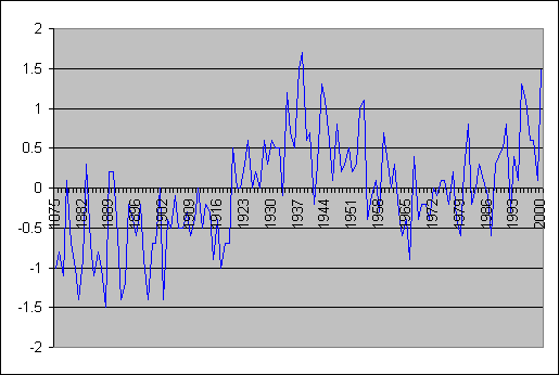
Well despite the warmth of the 1930s the arctic ice sheets failed to melt away, and my city isn't under 20 feet of water due to increased sea level rises. Thank godness for that, I can now rest in peace.
Associated with the LFO, SAT record shows two periods of highest temperatures in the Arctic: in the 1930-40s, and in recent decades. In contrast to the global and hemispheric temperature, the maritime arctic temperature was higher in the late 1930s-early 1940s than in the 1980-90s.
A graph of their analysis is shown below:
Well despite the warmth of the 1930s the arctic ice sheets failed to melt away, and my city isn't under 20 feet of water due to increased sea level rises. Thank godness for that, I can now rest in peace.
Proof that global warming doesn't exist
As Time Blair points out,
Robert Fisk writing for the The Independent discusses the proof that global warming exists because her mother shot a 50 year old home video of snow in Maidstone (half way between London and English Channel). He says:
"There must have been two feet of [snow] in the garden. You can even see the condensation from my mouth."
Of course how the weather has changed recently and he tells us we should indeed Fear climate change
However this week the snow has returned to London, and for an extra example for good measure, here is Maidstone in 1987:

So I guess according to Robert Fisk's own arguement, this is proof that global warming doesn't exist.
In reality of course, this proves that it's so easy to find evidence that fulfills your perception of the world and ignore evidence that doesn't. Hence, of course, we really have to leave it up to the true scientific unbiased method when analysing climate change, not people's opinions.
Robert Fisk writing for the The Independent discusses the proof that global warming exists because her mother shot a 50 year old home video of snow in Maidstone (half way between London and English Channel). He says:
"There must have been two feet of [snow] in the garden. You can even see the condensation from my mouth."
Of course how the weather has changed recently and he tells us we should indeed Fear climate change
However this week the snow has returned to London, and for an extra example for good measure, here is Maidstone in 1987:
So I guess according to Robert Fisk's own arguement, this is proof that global warming doesn't exist.
In reality of course, this proves that it's so easy to find evidence that fulfills your perception of the world and ignore evidence that doesn't. Hence, of course, we really have to leave it up to the true scientific unbiased method when analysing climate change, not people's opinions.
Tuesday, February 06, 2007
Brisbane bans cars for no scientific reason
Brisbane is contemplating banning cars from the city in an attempt to combat climate change. A $50,000 report also suggested that
cyclones, floods and bushfires could become the norm if the city does not convert to solar energy and boost public transport usage.
Well we've already proven that cyclones have not been increasing in Australia, but what about floods?
Thanks to the BOM, we have information about the flooding of the Brisbane and Bremer River as shown on the graph below.

The floods of the Brisbane River appear to be coming less in number with only 1 Major flood in 107 years, this compared to 8 major floods in the 60 years before that. Brisbane river also had 14 moderate floods fro 1840 to 1900 and only 2 since then.

The Bremer River at Ipswich data as shown above, shows some very minor floods in the past few years. This could well be due to more recorded observations of very minor activity in the area. But lets look at the more devastating big floods hey? Eight major floods in the last 107 years (one per 13.37 years), and 9 in the 60 years before that (one per 6.67 years) - twice as much. And 18 moderate floods in 107 years (one per 5.94 years) and 9 moderate floods in the 60 years before that (one per 6.67 years) - a small yet insignificant difference.
cyclones, floods and bushfires could become the norm if the city does not convert to solar energy and boost public transport usage.
Well we've already proven that cyclones have not been increasing in Australia, but what about floods?
Thanks to the BOM, we have information about the flooding of the Brisbane and Bremer River as shown on the graph below.
The floods of the Brisbane River appear to be coming less in number with only 1 Major flood in 107 years, this compared to 8 major floods in the 60 years before that. Brisbane river also had 14 moderate floods fro 1840 to 1900 and only 2 since then.
The Bremer River at Ipswich data as shown above, shows some very minor floods in the past few years. This could well be due to more recorded observations of very minor activity in the area. But lets look at the more devastating big floods hey? Eight major floods in the last 107 years (one per 13.37 years), and 9 in the 60 years before that (one per 6.67 years) - twice as much. And 18 moderate floods in 107 years (one per 5.94 years) and 9 moderate floods in the 60 years before that (one per 6.67 years) - a small yet insignificant difference.
Monday, February 05, 2007
Computer Hard Disk was too hot!
Ok my computer hard disk overheated, and there's no doubt why. No actually it just gave up, and hence I've lost a fair amount of data and analysis, so please excuse me while I get it all back and continue analysing Australia's temperatures,
but with all the hype about the IPCC report strangely not coming out, here's a reply from the contraversal fred singer.
but with all the hype about the IPCC report strangely not coming out, here's a reply from the contraversal fred singer.
Subscribe to:
Posts (Atom)