Tuesday, October 31, 2006

More Rain in the Wet, Less Rain in the Dry?

We proved on Friday that Australia, despite what many are saying is the worse drought on record, is far from it. Australia’s rainfall has been pretty constant over the years.

In fact, the ABM actually agree with us as well:
http://www.bom.gov.au/lam/climate/levelthree/climch/clichv4.htm

Because of the large year-to-year changes it is hard to detect any long-term trends in Australian rainfall.

But continue on saying:

However, some weak trends in rainfall have been identified. The percentage area of Australia experiencing extreme wet conditions has increased slightly this century while the area of extreme dryness has reduced.

Ahh, so despite the fact that global warming isn’t making Australia dryer, it’s climate change that is making the dryer places more dry and the wetter places more wet. Now we get you. So where’s the proof of this? Hmm…looks like there is none. If I remember correctly, their “weak trend” in regards to cyclones was proven non significant.

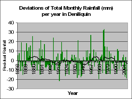
So where’s the proof of this? ABM don’t provide it, but using their own statistics, I decided to test it. From our sample we took the 5 most driest places in Australia, and the 5 most wet. These were as follows:

Most driest: MARREE (SA), WOOMERA (SA), CARNARVON (WA), TIBOOBURRA (NSW), MEEKATHARRA (WA).

Heard of them? No, that’s why no one lives there. There’s no water to flush the toilet.

Most Wet: COFFS HARBOUR (NSW), DARWIN (NT), BYRON BAY (NSW), THREDBO (NSW), CAIRNS (QLD).

Great places to Ski, surf, and well, wrestle with crocodiles.


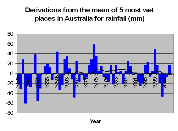
And the results are the following two graphs for the most driest and most wet. To be honest. I can’t see any pattern whatsoever. But let’s test it anyway. Tests prove, that there is no significant increase or decrease in rainfall in the 5 most wet places in Australia (F = 0.66, p = 0.421) and there is also no significant increase or decrease in the amount of rainfall in the 5 driest places in Australia either (F = 1.37, p = 0.244).

So how did the ABM come to these conclusions that the dry is drying up and the wet is wetting up? Either they have terrible statisticians working for them (lets hope not), or they want to prove that climate change is, in fact, changing. I mean, there’s so much hype about it recently, that it’s possibly in the ABM’s best interests to prove that their work is ultra-important.

So why not claim that Australia’s rainfall patterns are changing more recently? Why not claim that because of this global warming results and humans are to blame? Why not claim that we have to act now or human civilization will be lost forever?

Why not? Because it all, quite possibly, could not be true.

Monday, October 30, 2006

Rising Sea Water will drown boats

The Sydney morning Herald have told us all what will happen to Sydney's shore line by the year 2100 based on global warming quoting that

billions of dollars worth of seaside properties up and down the coast are vulnerable to advancing shorelines and increased storm activity associated with climate change.

And the evidence:

Their modelling uses a range of sea level rises projected by the United Nations and the World Meteorological Organisation's International Panel on Climate Change of between nine and 88 centimetres by 2100.

But new scientific research has us increasing at 0.35mm a year or by the year 2100, just 3.2cm. Big difference.

But what is most funny, is the pictures that it produces with the first picture now, and the second picture what it will look like in the year 2100:


What happened to all the boats? Don't boats float on top of the water?

(thanks Tim Blair for this one)

Global Warming causes snowstorm!

Buffalo News reports that global warming is the reason behind a surprise massive snowstorm around someplace called Buffalo where all the local buffalo are now snap frozen like the wooly mammoth.

The newspaper reports that

As the climate changes and temperatures generally increase, we are more likely to see unpredictable, intense weather and, in Buffalo, more lake-effect snow.

God Holy Moses! So does this mean that the temperature is going to increase so much that the temperature will decrease? I don’t want to be snap frozen either! Someone save me from this intense freezing cold heat wave.

Tim the Tool Man

Tim Flannery, one of Australia’s leading scientists and also one of Australia's leading doomsday preacher comments on the impact of rising sea levels:

Picture an eight-storey building by a beach, then imagine waves lapping its roof. That’s what a 25-metre rise in sea level looks like.

Well lets once again look at the stats. Research has proven that in the last 7 years the sea levels have risen 2.5mm. SO that’s on average 0.35mm per year.

So how long will it take to reach 25 metres? Well a good 70,000 years. By then, I'm sure we'll all be living on mars. And a skyscraper on the beach? You honestly think they'll be such thing as a sky scraper in 70,000 years time?

Picture of what we might look like in 70,000 years time.

Sunday, October 29, 2006

The Big Finley Dry

John Howard has been traveling the countryside hearing heart wrenching dry stories from people most suffering from the current drought. He's being told that this isthe biggest drought in Australia’s history.

He went to visit irrigator Eric Dudley who live in Finley which is located in southern New South Wales, close to Wagga Wagga and even closer to the nearest Weather Station at Deniliquin. Dudley’s irrigation channels are completely dry, and it is reported that “dust blows incessantly across open plains.”

Dudly also says that they have never seen such bad conditions in a region known as Australia's food bowl and that he will reach financial ruin should conditions continue. It’s such a terrible story. And one that my heart doesn’t go out to.

But lets check the stats for Deniliquin, only around 50km form Dudley’s farm.


The graph on the left shows the rainfall for Deniliquin since 1858. It shows a pretty consistent graph with some big rainfall years and other less so, but either way, no significant increase or decrease.

More recently we had some bad years in 2001, 2002 and 2004 where Deniliquin averaged 9, 17 and 19 mm of rain less than the norm per month respectively. The breaker in the middle 2003, along with 1999 and 2000, had increased rainfall with on average 3.6 mm more than average per month. Considering that Deniliquin averages 33mm per month of rainfall, a drop of 10 to 20mm a month is considerable less, but as the graph suggests, definitely one that is not abnormal.

Similarly, there are plenty of great big spikes where Deniliquin has seen able rain. So it’s true, over the past couple of years we have seen decreased rainfall in this area. Is it the worst drought of all time here? Well no. Between 1895 and 1902 Deniliquin had 8 years of rainfall that was less than the average per month. Between 1940 and 1945 Deniliquin averaged 10mm less than the average per month. That’s over 70 months in a row with less than 10mm less rainfall than normal, which is surprisingly the same amount less than the current period from 2001.

Of course our heart goes out to Eric Dudley. He is experiencing less rainfall than normal at current. And If John Howard wants to hand out money to the dehydrated, then I’m all cool with that.

But one things for sure, that this recent dry weather in the south of New South Wales is well, quite normal. It’s not the worst drought in Australia’s history, and we are not even experiencing a trend of less and less rainfall per year – even in Deniliquin. Global warming has nothing to do with rainfall patterns. And either does level’s of Co2 in the air and human influence. Did I say one things for sure? I meant five things.

You’d have more chance at getting rain in Deniliquin by doing a rain dance rather than cutting down on those awful Co2 levels.

Friday, October 27, 2006

Is it the worst drought on record?

Drought, the buzz word at the moment is hitting Australian farmers hard. In Queensland, the government are meeting to give assistance to the farmers. Telstra are giving farmers more time to pay their bills, and the ABARE says that the current drought will cost Australia over $6.2 billion.

John Howard has been listening to heart wrenching dry stories , even golf courses are effected and if it’s not the hot dry that’s ruining crops, it’s the freezing cold as well:

Thanks to Andrew Bolt who writes that Deputy Premier of Victoria John Thwaites says that

So all the evidence points to a significant involvement of global warming in the present drought.

Professor Peter Cullen, a National Water Commission member and top government adviser, who gloated that, thanks to the drought,

flat earth skeptics who have been in denial about climate change are now realising that wishing it away didn’t work

So what is a drought exactly? According to the dictionary it’s a period of dry weather, e.g. no rain. Given that, it makes perfect sense that this terrible time of lack of rain we are experiencing now would show up in the data. I mean, after all, that’s why we all say there’s a drought right? – not just from some people’s opinion on it all.

Let’s check out the stats.


According to the ABM, the graph on the left shows Australia’s rainfall patterns since 1900. If anything the longer trend tends to suggest an increase in rainfall over this period. However the result when testing is not significant (F = 1.25, p = 0.266). Hence we can conclude that Australia’s rainfall has not significantly increased or decreased over time.


But we are talking about global warming aren’t we? Well here’s the graph which talks about global rainfall on the left. Hmm, no real pattern there either. If anything, it's cyclic.

Could it be, that with the last 4 years having less rainfall than previously (but still remember not significantly less), that individuals are complaining of lack of water because it didn’t quite get to the levels of the 5 years before that? Or is this trend simply natural? Like when animals hide food for when times are tough, were these farmers spending their water expecting the same big waters of the 5-10 year ago stage, and still spending their water in the same way, expecting the downpours, not getting them, and them claiming drought and handouts from the government?

If the rain patterns show no long term reduction, then where’s the drought? Where?

More on this, with more detail soon.

Thursday, October 26, 2006

False Optimism

MSNBC reported in May:

The 2006 Atlantic hurricane season will be very active with up to 10 hurricanes, although not as busy as record-breaking 2005, when Hurricane Katrina and several other monster storms slammed into the United States, the U.S. government’s top climate agency said on Monday.
“NOAA is predicting 13 to 16 named storms, with eight to 10 becoming hurricanes, of which four to six could become ‘major’ hurricanes of Category 3 strength or higher,” said Conrad Lautenbacher, administrator of the National Oceanic and Atmospheric Administration.


But unfortunately for him this never happened:

Instead, it has been a long, lazy hurricane season with just half the number of hurricanes predicted and not a single one making landfall.
"Weather forecasting is a chancy business,” said Hugh Willoughby, a professor of hurricane science at Florida International University. “It’s gotten a lot better, but if you can’t stand being wrong, you shouldn’t be in the business."


Thanks to Tim Blair who reports that

Can’t predict tomorrow’s weather, can’t predict next year’s weather ... yet there’s a scientific consensus about weather in the coming century and beyond. Just as well these folks are adapting to being wrong.


And what about Australian Hurricanes/Cyclones?


This graph on the left as given out by the ABM shows the number and intensity of cyclones from the year 1970 to 1998. They report

that the total number of cyclones has decreased in recent decades. However, the number of stronger cyclones (minimum central pressure less than 970 hPa) appears to have increased slightly.

Interesting. I don’t come to the same conclusion. My statistical analysis of the data given on that graph actually come to the conclusion of a statistically significant decrease in the number of cyclones over the period from 1970 to 1998. (F = 4.99, p = 0.034). For those not in the statistical know-how. Generally scientists prove a significant result if the p value is below 0.05 (5%). This means that there is a 3.4% chance that the decrease in cyclones in this period is due to luck or random variation.

My analysis of stronger cyclones proves no significant increase or decrease over this time period (F = 1.17, p = 0.289). Hence we can conclude, contrary to what was written by the ABM that there is no evidence to prove that strong cyclones have increased or decreased in the past 30 years, and strong evidence that the total number of cycles has significantly decreased.

I guess people see different things in graphs when they want to believe. Lucky we can test this to prove it instead.

Australian Temperatures

There has been a lot of hype regarding climate change and global warming. Millions of dollars have been pored into analysis and what we can do to make the world a greener planet. I am all for making the planet better, but the question has to be asked, how much should we spend (that we would otherwise be spending elsewhere) to do so, and will it make any difference at all, and if so, are there any benefits or not?

Of course, I can't answer all these questions myself. My area of expertise is statistics, and I plan on analysing weather data, mainly from Australia, in order to determine the magnitude of the well advertised recent temperature increase, and prove whether or not this increase is actually statistically significant or not. If it is, there could well be a case for global warming. Whether or not this is human or naturally induced is another question. If not, then we should seriously consider our perspective on the phenomenon.


We’ve all seen the graphs of increases of temperature, with a sharp increase in the last 20 years. The Australian Bureau of Meteorology is Australia’s own government run weather company. This graph given on the left is from them and it shows the temperature from 1910 until 1999. It shows a reasonably constant temperature of 0.25 degrees C below the average of 1961 to 1980 between the years 1910 to about 1960. After 1960 we have about a 0.25 degree increase for 20 years to be on level with the 1961 to 1980 period (kinda makes sense doesn’t it, that the average temperature from 1960 to 1980 is about the same as the average temperature from 1961 to 1990). Following 1980 we have another increase of about 0.25 degrees and this remains pretty constant for the next 20 years. Hence since 1991 we have had an average increase of 0.5 degrees.


This is highlighted more clearly by some more graphs done by the bureau in moe recent times up until 2003. On the left if the Annual Mean Temperature Anomalies for Australia from 1910 to 2003. The difference is definitely significant. Prior to 1970 there were only 7 times when the average mean temperature was above the 1961 to 1990 average.


The annual maximum temperature anomalies for Australia given on the left show a similar pattern, not quite to the same extremes, but an obvious increase in temperature. When looking at the annual minimum temperature as given below the difference is intensified. It seems that Australia is heating up more at night that during the day, although both have significant increases in the last 20 years. With regards to the annual minimum temperature anomaly from the period to 1916 to 1958, not one year recorded a minimum temperature higher than that of the average of 1961 to 1990.


We shall be discussing these graphs, as well as the start of our own analysis in a lot of detail. Stay tuned peoples!