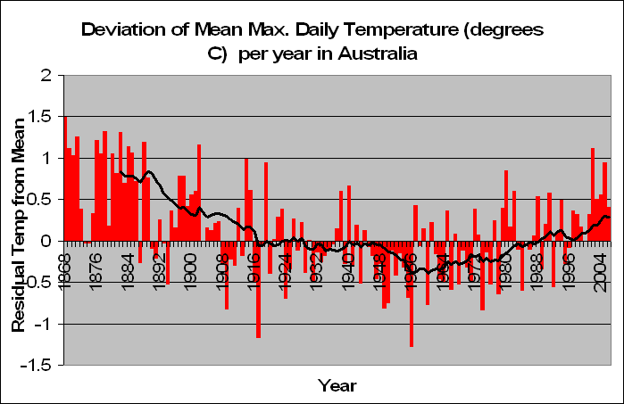
Given on the left is Australia’s Deviation form the mean of Average Monthly Maximum Temperatures. The pattern in it is startling and obvious. Since 1868 we have had a decreasing maximum temperature in Australia. This trend continued to decrease until about 1960, and from then until about the year 2000 the temperature remained relatively constant. It is quite clear from this graph why scientists in the 60s and 70s were warning of the earth possibly going into another ice age. If temperatures kept decreasing then who knows what might happen.
Fortunately it didn’t, and the next 30 years so an evening out process where maximum temperatures were scattered around the mean. What is certain, is that the past 5 years have seen a higher maximum temperature than normal, around 0.7 degrees higher. But this is of course only 5 years. The heatwaves of 1875 to 1886 recorded 0.9 degrees above normal over 12 years. 8 years of heat from 1895 to 1907 produced 0.6 degrees above normal on average. Just after the second world war we had 12 years in a row of lower than average maximum temperatures.
Such departures from the mean are in fact normal and occur largely due to random variation. If the increase in temperatures in the past 5 years is due to human CO2 activity, then how were the temperatures pre 1900 just as hot if not hotter? The cyclic nature of this graph seems to be obvious, although it must be noted that there is not enough data to prove that statistically.
It is quite true, that from around 1950 temperatures have been increasing. So much so, that if one only had the data in the last 60 years there would be ample evidence that we are in a hotting up Australia. But with more data, comes more evidence.
What is interesting is the graphs that the ABM give. They for starters don’t show a decreasing temperature trend from 1910 to 1960. There is a lot of scientific evidence out there that the decrease in temperature was pretty global and there were a lot of fears that we were entering a stage of global cooling. Why doesn’t the ABM graph show this? Mine does!
There are two reasons why I can guess that the ABM have only data from 1910, when their records go as far back as the mid 1800s. The first is obvious. I’ve proven that the mean maximum temperatures at this time were even hotter than today. Why would the ABM want to show this? This would prove that humans are not the cause of global warming and it is just a normal natural variation. The other reason might be that they conclude that the earlier data was not very reliable.
My analysis suggest that as well, that the years from 1858 to 1868 is very unreliable data, but from then on, it is very comparable with today’s (more on that later). So given it’s reliability I have to go back to my original claim that the ABM don’t want to show the world that Australia was once hotter than it is today.
My opinions and analysis is totally unbiased. So much so that I will in fact give evidence for a warming up Australia tomorrow when we look at average minimum temperatures. But one thing is for sure form this analysis, that humans are not the cause of increased average maximum temperatures in Australia. Period.
5 comments:
wow great reading mate. Keep it up.
Hi Jonathon
I asked about the temperature records yesterday. Thank you I eagerly await more graphs and stats analysis.
Regards Michael R
In the seventies, the environmental doomsdayers said we were all going to freeze to death in a nuclear winter. Now we are all going to fry in a global warming summer. Interestingly, the culprit was the same - human enviro pollution, particuarly CO2. Most people currently duped by the Global Warming fiasco are unaware of this, let alone the political and commercial factors driving the scare-mongering. - Rob L
Dear Jonathan,
I have just stumbled onto your blog. Thank you for the interesting analysis you have been doing. You are correct that most analyses of the historical record of temperature, both in Australia and internationally, have focussed on max and min temperature, so your work to analyse what is happening at specific times of the day is potentially very useful.
However, there are serious concerns about the consistency of the data you have analysed. As you can imagine, it is very difficult for anyone to ensure consistency of measurements of anything over a century or more. In the case of temperatures, instrumentation, exposure of the instruments, and even the location of the instruments have changed. One major change was the introduction of the Stevenson Screen at various times between the late 19th and early 20th century. This change in exposure means that the 19th and early 20th century temperatures cannot be simply compared with modern temperatures.
For a discussion of this problem and the sort of bias it introduces into simple analyses of the historical record of Australian temperatures see Nicholls,N., R.Tapp, K.Burrows, and D.Richards, 1996. Historical thermometer exposures in Australia. Int. J. Climatology, 16, 705-710.
For a brief discussion of other problems with temperature measurments, plus a discussion of the historical record of temperature at Alice Springs, pointing out the problems with just using the raw data without considering the non-climate influences on the Alice data see Neville Nicholls, Dean Collins, Blair Trewin & Pandora Hope, 2006. Historical instrumental climate data for Australia – Quality and utility for palaeoclimatic studies. J Quaternary Studies, 21, doi:10.1002/jqs.1054.
Finally, one reason why people concentrate on max and min temperatures is because daylight saving introduces some interesting biases into the temperature measurements at fixed times of the day in summer. Daylight saving was introduced at various times in the different states of Australia, and it is difficult to remove the bias this may have caused.
I look forward to seeing your further analyses, and hope the above is some use to you in this regard.
Cheers,
Neville
Thanks Neville,
you may note that my most recent analysis has basically looked at 1910 and onwards because of this bias. I understand that it occurs. Day light savings are factored into the results, so when looking at time analysis, the times given are those that are of greenwich "natural" time, so there should be no difference when daylight savings occurs.
Thanks for the links, I shall look them up.
Cheers, Jonathan
Post a Comment