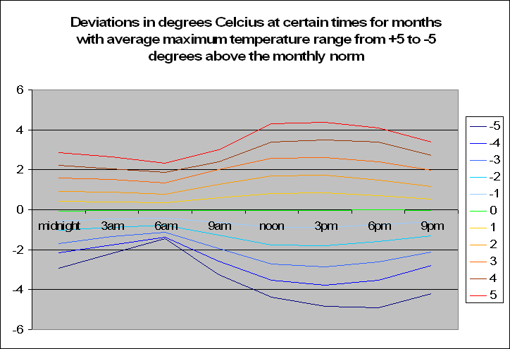
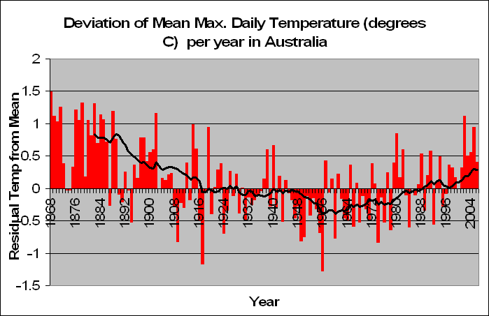
But lets look a little closer. Instead of summing up the data by looking at years, we decided to look at months. In fact a total of 83,000 of them. We decided to look at the months in particular which recorded a maximum temperature of say 5 degrees above the norm. For these months, what was the temperature like during the course of the day?
 The graph to the left may look very confusing but let me explain. Basically, it shows the average deviation in temperature at certain times of the day, given that month showed a maximum temperature at a certain deviation from the average. Ouch, now that’s something to get your head around. Don’t stress, I shall explain. Lets look the top line, the bright red one. The legend on the right says that this is the average deviation from the norm at certain times of the day when the maximum for the month is 5 degrees above normal. In fact as we go down from 4 degrees above normal, to 3 to 2 and down to -5 we see a trend. The temperature is in fact becoming less. But this of course makes perfect sense.
A particularly hot month will of course have hotter times throughout the day. But what is interesting is that when looking at the graph, is that the greatest deviation occurs from between noon and 6pm when the maximum would occur. However, the deviation at say 3am-6am is nowhere as extreme when the sun goes down, especially for temperatures of negative monthly maximum deviations. Of course one could argue that the temperatures at night do not vary by as much, and hence it would be better looking at standard errors from the norm instead of temperature deviations and this is true, but this is just the first step in looking at time based data during the day.
This analysis alone proves that the current analysis being done by climate scientists based on purely maximum and minimum temperatures is hardly in depth enough – especially if we plan on spending billions of dollars on it. It still seems crazy to me, that the entire global warming science is based on analysis on simple statistics of which even this blog in a matter of several weeks has more than outdone the scientific literature on the matter.
What conclusion can we make to this research in this post? When analyzing a month that has an increased or decreased maximum temperature from the norm, the same deviation doesn’t occur throughout the day, and is significantly reduced when the sun is on the other side of the world.


