I promised you some good analysis on Southern Pilbara (central-west Western Australia) yesterday when I analysed the temperatures and I keep to my promise so here it is:
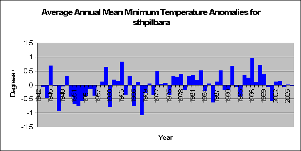
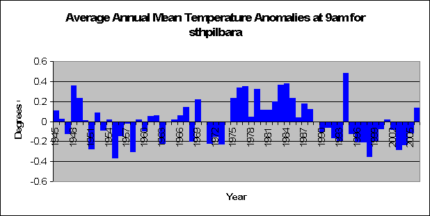
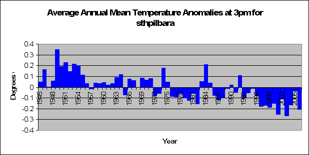
Yesterday we came up with the very unusual result that despite the fact that there was no significant increases in temperature from 9pm to 6am in southern Pilbara - and not even any recogniseable patterns – we found that the area recorded a significant increase in minimum temperature. This is very surprising. We also found that in the area temperatures were significantly higher from 9am thru to 3pm when the sun is at it’s hottest.
At first look it’s quite clear that the reason southern Pilbara is heating up is solely due to the sun. The sun is just getting damned hotter. So why the increase in minimum temperatures, especially when there is no difference in temperatures throughout the night?
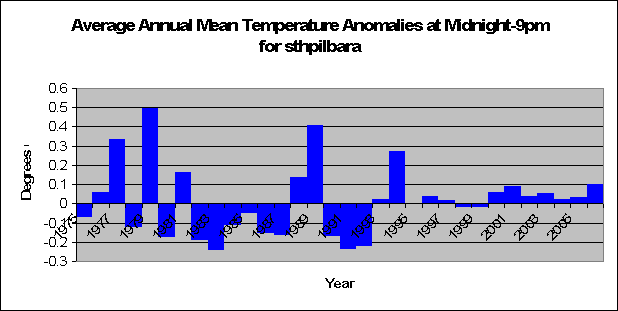
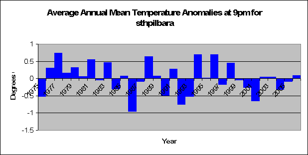
I decided to have a look at the differences in temperature anomalies for neighboring times over the years. In other words, I looked at the temperature anomalies for Midnight minus 9pm. As previously noted, 9pm doesn’t have a lot of data for Southern Pilbara so it is hard to find a pattern, and the statistics suggest no difference (t = 0.24, p = 0.81). In other words, Midnight has not been heating up at a quicker rate than 9pm over the years in Southern Pilbara.
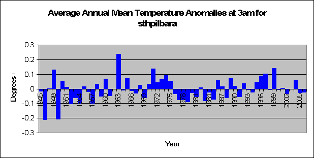
The same goes for 3am minus Midnight, only this time we have a good amount of data. There is no pattern. Temperatuers at 3am have not been heating up quicker or slower than Midnight over the years (t = 1.4, p = 0.15).
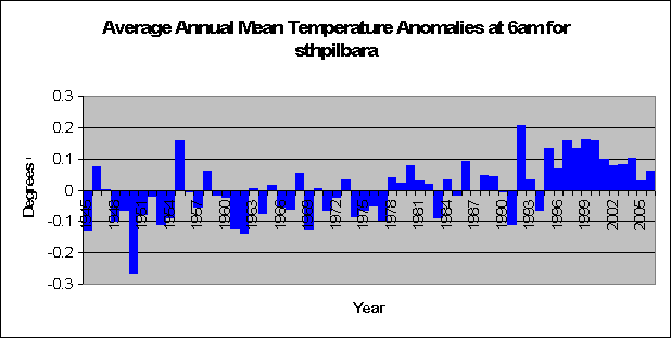
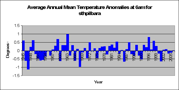
But wow, look at this. When looking at 6am minus 3am, we find that temperatures have increased at a significantly higher rate at 6am than 3am (t = 5.3, p < 0.01). Keeping in mind that we did not find a significant increase in temperature at 6am, however we have found that the temperature increase at 6am is significantly greater than 3am. This has occurred with especial magnitude in the last 10 years as shown in the graph.
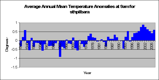
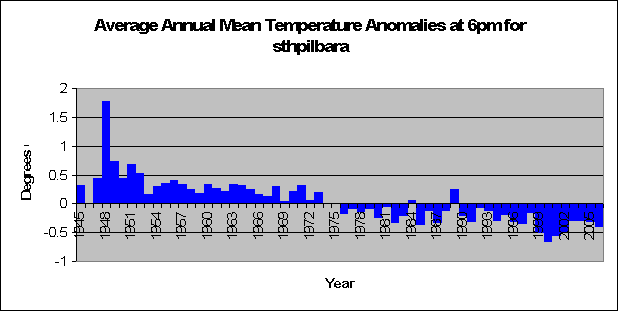
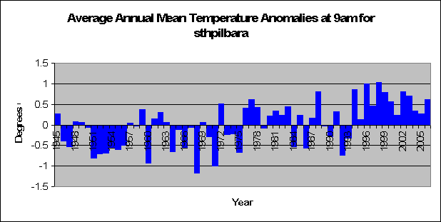
And a similar pattern occurs when looking at the 9am – 6am anomalies. A significant increase occurs (t = 6.04, p < 0.01). With temperatures increasing on average 0.5 degrees more in the past 10 years. If you look at the 6am and 9am graphs, this makes sence, as in the last 10 years 6am was about average temperature whilst 9am temperatures were about 0.5 degrees above the norm.
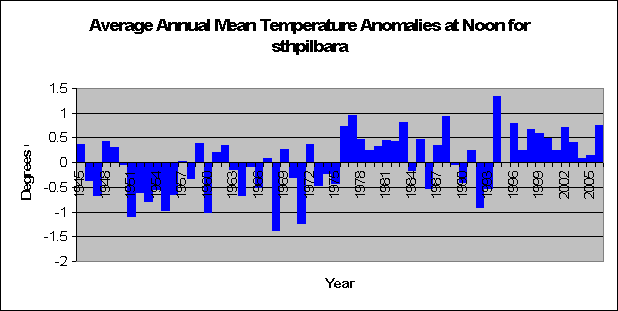
Surprisingly this is where the large boom stops. Analysis of Noon minus 9am temperatures suggest no increase or decrease in temperature (t = -0.6, p =0.55). A cyclic pattern can be seen, but this could be purely due to random variation.
And now for the even more surprising results. 3pm minus Noon saw a significant decrease in anomaly temperatures (t = -8.1, p < 0.01). The decrease is almost perfectly linear and is clearly obvious. So despite significant increase in temperature for south Pilbara for Noon and 3pm, 3pm isn’t heating up as much as it has been 3 hours before.
The obvious linear line in the graph of 6pm to 3pm is startling. So perfect is the line, that the amount of variability is very small. The decreasing trend is very significant (t = -10.8, p < 0.01).
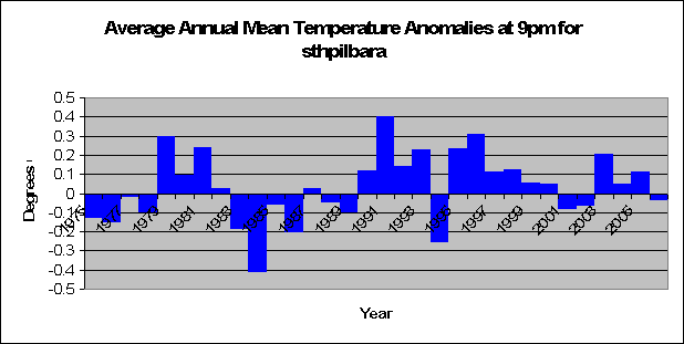
There was no significant difference in temperatures when looking at the differences between the 9pm and 6pm anomalies, however a smaller database for temperatures at 9pm could have been a factor (t = 1.3, p = 0.18).
So what does all this mean? How is this all relevant. Well let’s summarise what we have just found. The rate of increase or decrease in temperatures with respect to the time 3 years prior makes little difference at night, but when the sun is a factor the difference is significant. Temperature anomalies at 6am and 9am have increased significantly with respect to the time 3 hours previous over the years, whilst temperatures at 3pm and 6pm have decreased significantly with respect to the time 3 hours previous.
But to understand fully what this means, we have to discuss very briefly how daily temperature works. Basically we reach a maximum temperature, and from that point on the temperature generally decreases. When the sun as set, there is no general reason why temperatures will be on the rise, so they decrease until the sun makes an appearance again. In southern Pilbara the sun rises in general half way between 6am and 9am depending on the season.
We suggested before that is was relatively obvious that the sun was a major factor in determining the average maximum temperature in Southern Pilbara, as we saw no increases in temperature over night. We have also proven that the sun has made significant increases in maximum temperature rather than minimum during years when Australia is heating up. So would a stronger sun therefore also have an influence on minimum temperatures? Our analysis suggests so.
Whilst no increases in temperature were found for Southern Pilbara from between 9pm and 6am when the sun was set, at 6am, the temperature increase as compared to 3am was highly significant. The sun, whilst not risen, quite possibly was warming up neighbouring areas more than normal, and adding heat to the air above at a greater rate than normal. Thus paving the way for when it makes its grand entrance at sunrise.
Hence, whilst not making a significant temperature difference at 6am before sunrise, it made a significant increase in temperature compared to 3 hours prior at a time where normally the minimum temperature would have been reached. This extra layer of heat paved the way for massive increases in temperature at 9am after the sun had risen. Following, due to the massive increases in temperature 9am, Noon and 3pm also had increasing temperatures due to the intensity of the sun, but not quite as dramatic as that when the sun rose. Hence we have a situation where we have a significant increase in temperature at 3pm but a highly significant decrease in temperature at 3pm with relation to Noon. I guess there’s only so much difference that the sun can make.
So what can we conclude about Southern Pilbara? That increases in the suns intensity has caused the area to heat up during the day, to stay at a constant temperature during the night, and most importantly, that increased intensity in the sun has not only caused increases in maximum temperatures but also increases in minimum temperatures.
Who would have thought that the sun has something to do with heat?
Friday, February 23, 2007


Thursday, February 22, 2007
The Globe will be cooler
First it was naughty screensavers that were bad, and now it is the ordinary light globe. Australia is planning on banning the light globe in favour of the energy saving counterpart. Of course we shouldn't worry about some of the problems that the energy saving light globe can cause like these:
Here are some known issues with Compact Fluorescent Bulbs.
Instead, lets look at the benefits that getting rid of the energy wasting globe will save. As noted by MSNBC
Legislation to gradually restrict the sale of the old-style bulbs could reduce Australia's greenhouse gas emissions by 4 million tons by 2012.
Note the word could. So best case scenario, we'll save 4 million tons of greenhouse gas by 2012. Lets assume that 100% of recent warming is caused by the deadly gas, and given that Australia's greenhouse gas output is 1.6% of the worlds, and that we have seen an increase in 0.6 degrees in the last century this will mean that banning these light globes will make the world on average
0.0000012 degrees cooler per year.
Keeping in mind that this is a best case scenario. I can almost feel a chill in the air right now.
Here are some known issues with Compact Fluorescent Bulbs.
Instead, lets look at the benefits that getting rid of the energy wasting globe will save. As noted by MSNBC
Legislation to gradually restrict the sale of the old-style bulbs could reduce Australia's greenhouse gas emissions by 4 million tons by 2012.
Note the word could. So best case scenario, we'll save 4 million tons of greenhouse gas by 2012. Lets assume that 100% of recent warming is caused by the deadly gas, and given that Australia's greenhouse gas output is 1.6% of the worlds, and that we have seen an increase in 0.6 degrees in the last century this will mean that banning these light globes will make the world on average
0.0000012 degrees cooler per year.
Keeping in mind that this is a best case scenario. I can almost feel a chill in the air right now.
Only the sun heats up Southern Pilbara
Ok guys you are going to love this, whilst not giving all the analysis away today, the rest will follow most likely Friday, but let me introduce the area first.
The area is southern Pilbara. Obviously south of North Pilbara on the west coast of Australia. A delightful place. Some great national parks, and not a lot in between. Anyway, There are three main weather stations in the area with significant data, these being Carnavon airport, Meekatharra airport and Geraldton airport.
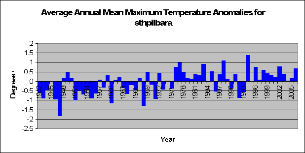
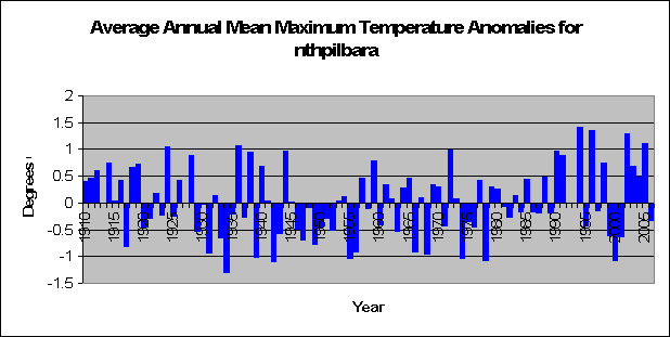
Analysis of maximum and minimum temperatures shoes a very significant increase in maximum temperatures (t = 4.87, p < 0.05) and a significant increase in minimum temperatures (t = 2.3, p = 0.023). So it seems at first that this place is just hotting up all year round. Data for this area is pretty good, all temperature data (max, min, and specific times) go back to the mid 1940’s with the exception of 9pm which starts in 1975.
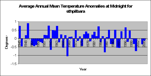
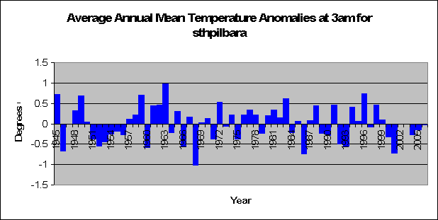
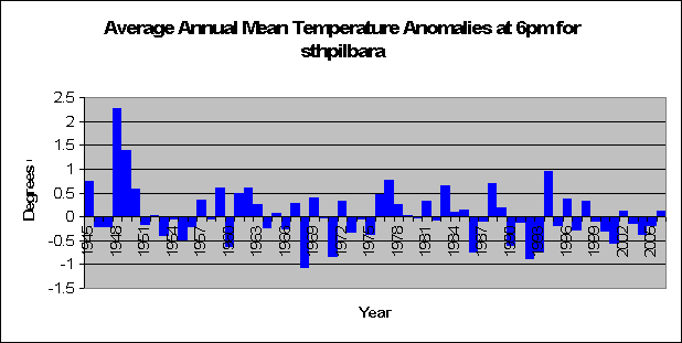
When we look at certain times we see a few interesting things. Temperatures at Midnight, 3am, 6am, 6pm and 9pm show no significant increase in temperature. (Midnight: t = -0.67, p = 0.5; 3am: t = -0.42, p = 0.67, 6am: t = 1.03, p = 0.30; 6pm: t = -1.94, p = 0.54; 9pm: t = -1.01, p = 0.31). In fact temperatures at 6pm almost show a significant decrease.
When we look at 9am, Noon and 3pm we see highly significant increases in temperature. (9am: t = 4.9, p < 0.01; Noon: t = 3.9, p < 0.01; 3pm: t = 2.7, p < 0.01). So in other words we are seeing that when the sun is in the air in full glory Southern Pilbara is heating up more so now that it has in the past. However, when the sun is on the other side of the globe and the stars are twinkling, there is no difference in temperature.
Seems like the sun has a lot to do with recent warming in southern pilbarara doesnt it? Well that would be the case, however we funnily observe a significant increase in minimum temperatures as well. This is very strange, as from between 6pm and 6am there was nothing to suggest that temperatures are increasing. So why has this strange phenomenon occurred? We’ll look real deep at the data tomorrow for some ground breaking research and amazing results.
The area is southern Pilbara. Obviously south of North Pilbara on the west coast of Australia. A delightful place. Some great national parks, and not a lot in between. Anyway, There are three main weather stations in the area with significant data, these being Carnavon airport, Meekatharra airport and Geraldton airport.
Analysis of maximum and minimum temperatures shoes a very significant increase in maximum temperatures (t = 4.87, p < 0.05) and a significant increase in minimum temperatures (t = 2.3, p = 0.023). So it seems at first that this place is just hotting up all year round. Data for this area is pretty good, all temperature data (max, min, and specific times) go back to the mid 1940’s with the exception of 9pm which starts in 1975.
When we look at certain times we see a few interesting things. Temperatures at Midnight, 3am, 6am, 6pm and 9pm show no significant increase in temperature. (Midnight: t = -0.67, p = 0.5; 3am: t = -0.42, p = 0.67, 6am: t = 1.03, p = 0.30; 6pm: t = -1.94, p = 0.54; 9pm: t = -1.01, p = 0.31). In fact temperatures at 6pm almost show a significant decrease.
When we look at 9am, Noon and 3pm we see highly significant increases in temperature. (9am: t = 4.9, p < 0.01; Noon: t = 3.9, p < 0.01; 3pm: t = 2.7, p < 0.01). So in other words we are seeing that when the sun is in the air in full glory Southern Pilbara is heating up more so now that it has in the past. However, when the sun is on the other side of the globe and the stars are twinkling, there is no difference in temperature.
Seems like the sun has a lot to do with recent warming in southern pilbarara doesnt it? Well that would be the case, however we funnily observe a significant increase in minimum temperatures as well. This is very strange, as from between 6pm and 6am there was nothing to suggest that temperatures are increasing. So why has this strange phenomenon occurred? We’ll look real deep at the data tomorrow for some ground breaking research and amazing results.
Wednesday, February 21, 2007
Not so hot Marble Bar
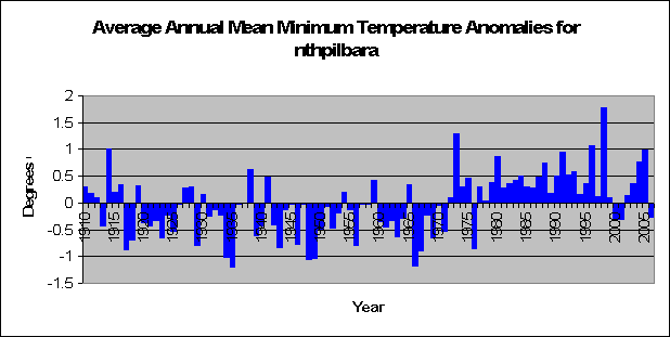
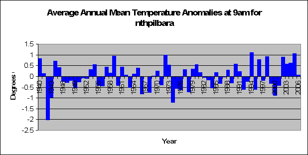
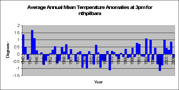
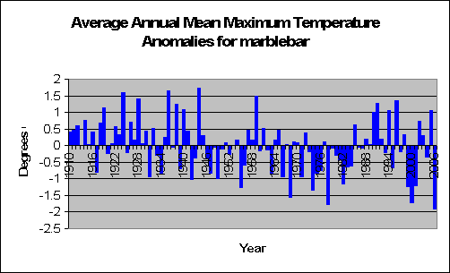
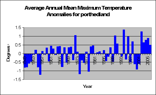
The Pilbara is a section of mid western western Australia, and to start off with we’ll look at the northern section of it. It’s very dry there. I once went to marble bar, and there’s not a lot going on. In fact, the only thing to do there was drink beer, which is what everyone naturally does. It’s very hot, all year around, and the amount of rain is very very low. So any increase would be a natural godsend. But lets look at the temperature first.
Monday, February 19, 2007
Polar Bear bites reporter: proof of global warming
60 Minutes has never heard of bears getting stroppy with intruders. So when one polar bear - normally a cute little zoo animal - bites a reporter they conclude the reason.....of course...global warming. As they report:
"If you still have any lingering doubts about global warming, stick around. We’re off to the Arctic, where Tara Brown found all the proof she needed that there’s something drastically wrong with the world’s weather. It came in the shape of a very large, very hungry polar bear - an angry predator, with us as its prey. Stranded in the middle of nowhere with a three-metre, 300kg bear on the attack is a frightening experience. It’s also a graphic lesson in what happens when we mess with nature. As global temperatures rise, the ice cap melts and the polar bears’ hunting grounds disappear. Now they’re starving, desperate for food - so desperate even humans look appetising."
Case closed. However the Wall street journal thinks otherwise:
"If you still have any lingering doubts about global warming, stick around. We’re off to the Arctic, where Tara Brown found all the proof she needed that there’s something drastically wrong with the world’s weather. It came in the shape of a very large, very hungry polar bear - an angry predator, with us as its prey. Stranded in the middle of nowhere with a three-metre, 300kg bear on the attack is a frightening experience. It’s also a graphic lesson in what happens when we mess with nature. As global temperatures rise, the ice cap melts and the polar bears’ hunting grounds disappear. Now they’re starving, desperate for food - so desperate even humans look appetising."
Case closed. However the Wall street journal thinks otherwise:
But hey, I can understand 60 minutes on one side. My next door neighbours car hissed at me the other day, so naturally I thought cats were almost extinct too. Thanks to Andrew Bolt.Apparently so, because there are in fact more polar bears in the world now than there were 40 years ago, as the nearby chart shows. The main threat to polar bears in recent decades has been from hunting, with estimates as low as 5,000 to 10,000 bears in the 1950s and 1960s. But thanks to conservation efforts, and some cross-border cooperation among the U.S., Canada and Russia, the best estimate today is that the polar bear population is 20,000 to 25,000.
It also turns out that most of the alarm over the polar bear’s future stems from a single, peer-reviewed study, which found that the bear population had declined by some 250, or 25%, in Western Hudson Bay in the last decade. But the polar bear’s range is far more extensive than Hudson Bay. A 2002 U.S. Geological Survey of wildlife in the Arctic Refuge Coastal Plain concluded that the ice bear populations “may now be near historic highs.” One of the leading experts on the polar bear, Mitchell Taylor, the manager of wildlife resources for the Nunavut territory in Canada, has found that the Canadian polar bear population has actually increased by 25%—to 15,000 from 12,000 over the past decade.
Mr. Taylor tells us that in many parts of Canada, “polar bears are very abundant and productive. In some areas, they are overly abundant. I understand that people not living in the North generally have difficulty grasping the concept of too many polar bears, but those who live here have a pretty good grasp of what that is like.” Those cuddly white bears are the Earth’s largest land carnivores.
Friday, February 16, 2007
Naughty Screen Savers
News just in! ANZ have just announced that they are banning screen savers from their computers to save on green house gases. Those bad naughty screen savers of flying windows and personalised photographs have to go in order to save the planet. Feb 23rd is the date when they all go, and no doubt from that day forward we will see more rainfall and colder weather.
What a difference it will make!
What a difference it will make!
Global Warming makes you rich
Time Flannery, Australian of the year and scaremonger of the year has revealed that he is charging at least US$50k per speech that he delivers.
Hmm, maybe I'm in the wrong profession. If I was campaigning for global warming, I'd probably be rich.
Hmm, maybe I'm in the wrong profession. If I was campaigning for global warming, I'd probably be rich.
Yep, Antarctica is still damn cold
A new report incdicates that Antarctica is not warming up as climate models suggest it should. David Bromwich, professor of geography and researcher with the Byrd Polar Research Center at Ohio State University said:
“It’s hard to see a global warming signal from the mainland of Antarctica right now.”
“The best we can say right now is that the climate models are somewhat inconsistent with the evidence that we have for the last 50 years from continental Antarctica. We’re looking for a small signal that represents the impact of human activity and it is hard to find it at the moment”
This comes as no surprise to readers of Gust of Hot Air. My analysis at Macquarie Island as well as at Mawson suggest that there is no increase or decrease in temperatures in the last 50 years.
So nothing new here...
“It’s hard to see a global warming signal from the mainland of Antarctica right now.”
“The best we can say right now is that the climate models are somewhat inconsistent with the evidence that we have for the last 50 years from continental Antarctica. We’re looking for a small signal that represents the impact of human activity and it is hard to find it at the moment”
This comes as no surprise to readers of Gust of Hot Air. My analysis at Macquarie Island as well as at Mawson suggest that there is no increase or decrease in temperatures in the last 50 years.
So nothing new here...
Thursday, February 15, 2007
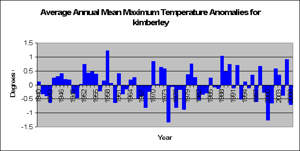
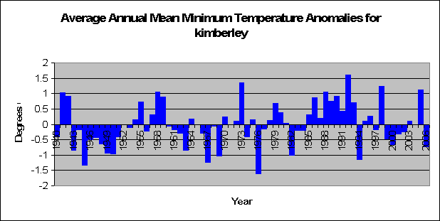
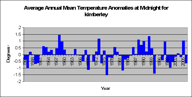
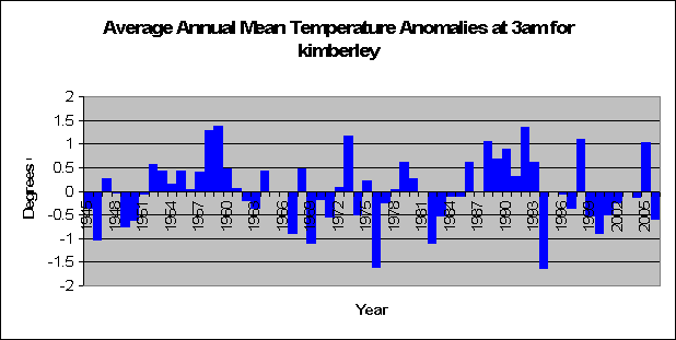
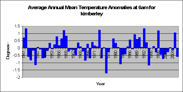
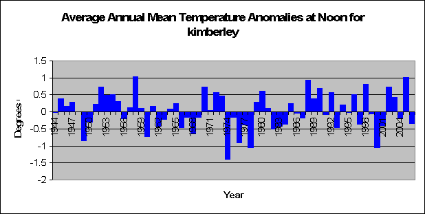
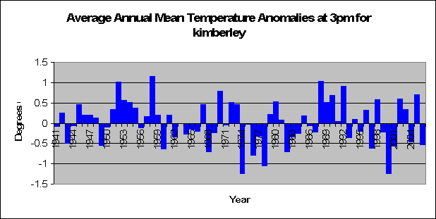
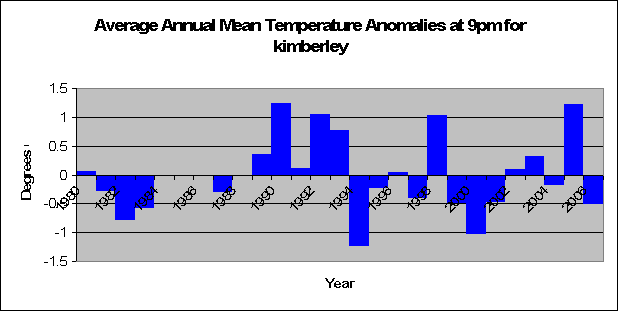
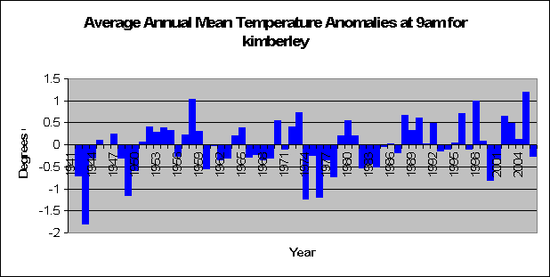
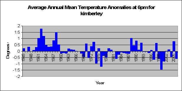
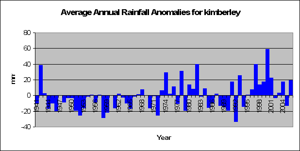
Kimberley: hot on the rise, cold on the set
Well after my hard disk on my computer over-heated due to global warming (well not really), I’ve managed to get the data again and re-write the programs that spit out all the fancy nice graphs. And it’s onto the next great section of

Wednesday, February 14, 2007
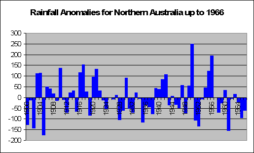
Global Warming Trends in 1966
Lets time warp ourselves back to 1966. Australian Politician Robert Menzies resigns, the Soviet Luna 9 spacecraft makes the first controlled rocket-assisted landing on the moon, Australia
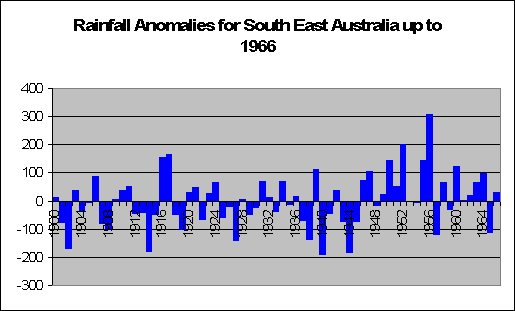
The graph below shows what is happening in northern

Subscribe to:
Posts (Atom)